When Dave asked this question in the studio the other day, we all knew what he meant right away. All websites look the same these days.
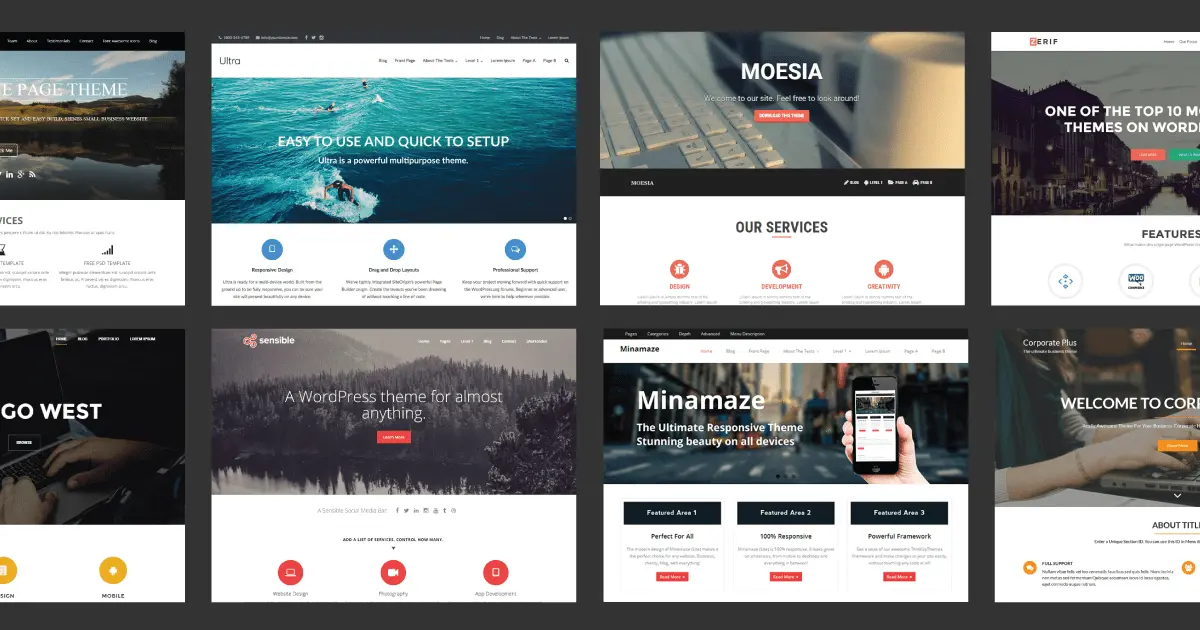
It took me about 3 minutes to grab the screenshots below.
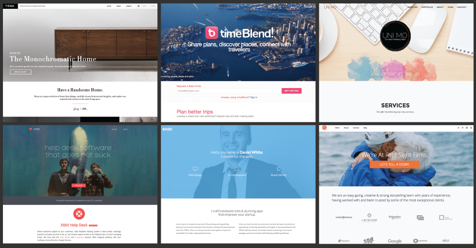
You know the style, large full width background image or video in the header, overlaid text, followed by a block of short text, and then the obligatory icon columns. I’m not saying it’s bad, in fact some of the sites above are quite beautiful, and work well.
The question is around why these websites have such a similar layout and visual style.
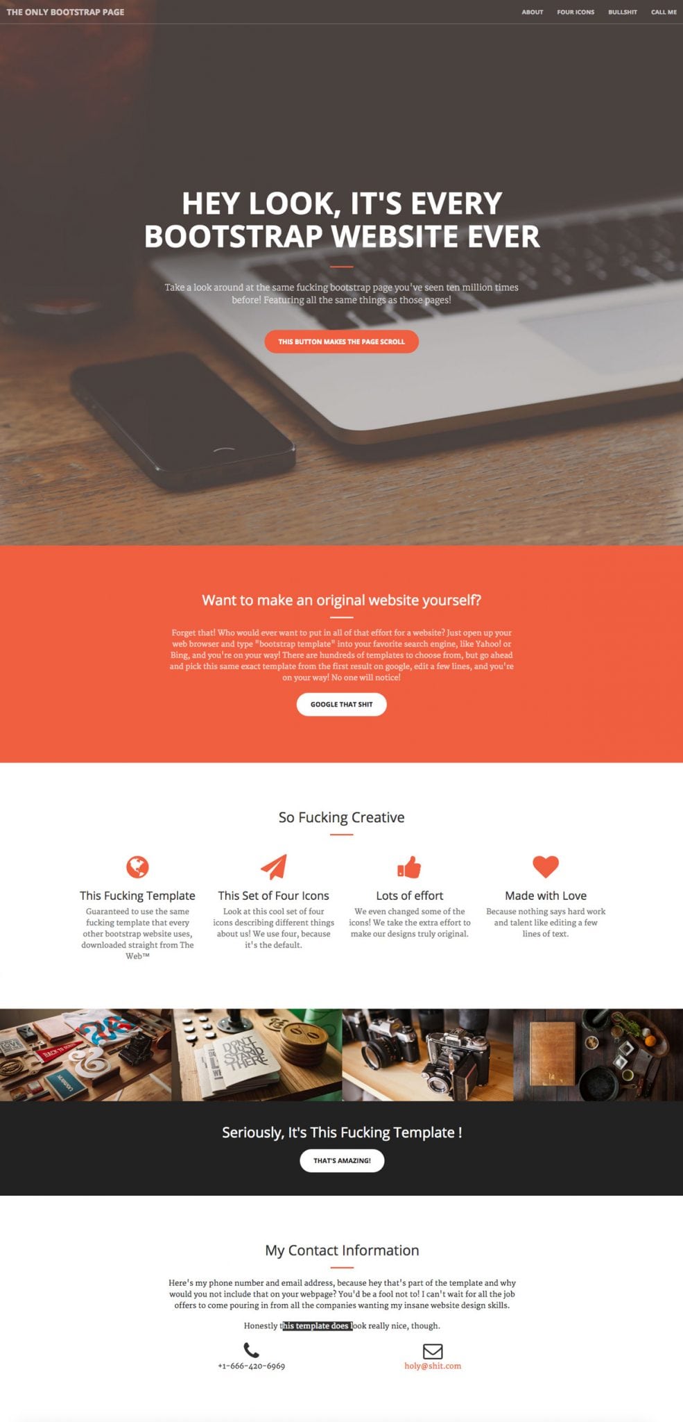
So now we know the What, let’s look at the Why. I don’t think there’s any one reason, but rather a combination of the below.
Bootstrap
When Dave asked the question, the first response was “Bootstrap”. Bootstrap is the most popular HTML, CSS, and JavaScript framework for developing responsive, mobile-first web sites. We use it all the time. Why? Because it’s the best tool in a web developers arsenal for creating smooth responsive websites.
As a designer and front-end developer, I love it. You design to the Bootstrap grid, and then use the Bootstrap ready classes when coding to bring the site to life. When designed and coded properly, Bootstrap sites work seamlessly across all devices.
As someone who has built responsive websites in the pre-Bootstrap era, I really appreciate the solid framework to work from. Currently, 1.8% of all websites online are built on the Bootstrap framework, so a lot of people agree.
While I love the grid layout and structure of Bootstrap, it also comes with inbuilt buttons, icons, and UI elements that you can quickly drop into a project. I think this is where the common Bootstrap style starts to come into play. If a designer works form the default CSS styles provided, then it’s not surprising that a common style will emerge.
Design Trends
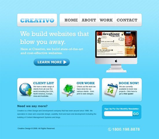
Remember “Web 2.0”? A phrase coined to describe a type of website more focused on user-generated content and social sharing across the web. Although to me it just conjures up memories of glossy photoshop buttons, gradients, and anything else to give a 3D effect to a web design.
I had a bank of Photoshop Glass button styles that I used for every design project. Sounds a bit cringy now, but at the time I thought it was the bees knees.
Is this “Bootstrap style” (as I’ll call it for the purposes of this discussion), the new web 2.0? The current trend call for flat buttons, and large areas of flat colour. If every action has an equal and opposite reaction then the current trend in web design is a clear reaction to the glossiness and detail of the Web 2.0 aesthetic.
So while some of the current styles of web design might be due to changes in technology, and a need to adapt to a range of mobile devices, there’s definitely a visual trend in play here too. A clean crisp aesthetic looks sharp and contemporary. Nobody wants a new website that looks old-fashioned now do they?
Themes
Themes. Go custom or go home. That’s my motto. Unfortunately, it’s not everybody else’s too.
When I say “theme” I mean a WordPress theme/template, basically a visual skin for your WordPress site.
Currently 25% of all websites are built using WordPress. Why? A lot of reasons, but essentially it’s a great system for content management.
Where WordPress comes into play in this discussion is that designers with no development knowledge can purchase pre-designed WordPress templates (there are free ones available also), install them on a website, and create a website.
Without any coding skills, you are restricted to the theme’s layout. “It’s a bit theme-y” is a phrase used a lot here in the studio when critiquing the websites of our competitors and clients competitors.
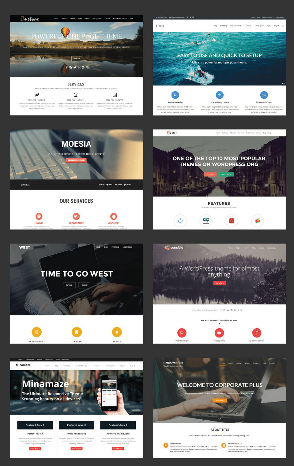
I browsed WordPress’s database of free templates, filtering by popularity, and the above were some of the results returned. Working on a pre-built theme like this means that you’re forcing your content to fit a theme, rather than designing a website around your content, which is the right way to do things.
It’s very safe to say that you don’t get a very original design either. From my experience, these types of websites are difficult to manage and you will just end up forcing a square peg into a round hole.
This would never be the way that we would approach designing a website. All of our websites are designed and build to suit our clients’ requirements and objectives. Before we even get to the design stage we have done a lot of work around planning and requirement gathering, UX research, wire-framing, and interactive prototypes. All of our websites are tailored exclusively to our clients and their brands. Read more about our process here.
There’s definitely a modern aesthetic in web design and a common visual style that can be found through a lot of contemporary web design. It’s not necessarily a bad thing as I said, but as designers, it’s something we need to be aware of.
Work within the Bootstrap grid for sure, keep things contemporary. Never use a pre-designed theme. But always remember to keep things fresh and original and focused on your objective and you will stand out from the crowd with something unique and beautiful.
[ratings]
