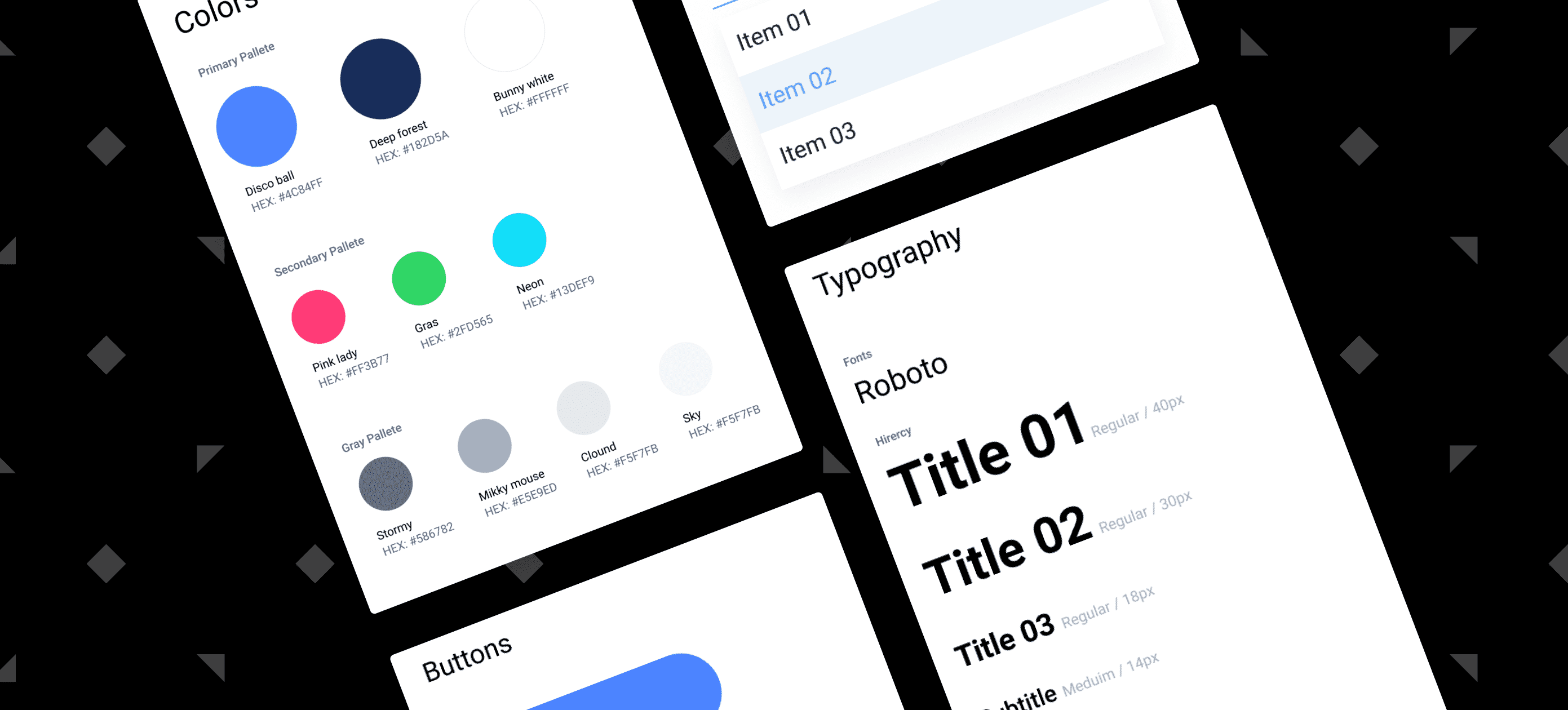
Why design systems are important: A single source of truth
Why are design systems important you ask? Although it might seem like a very modern approach to digital workflows, the idea and importance of a design system are not new to the creative industries.
Digital products are becoming more and more complex these days, and it is clear that product teams need to adapt their approach when developing new ones.
In order to deliver well-designed products, several companies have begun to take a more comprehensive approach to design, implementing style guides, components, and pattern libraries in order to build a better design structure and speed up the process.
What on earth is a Design System?
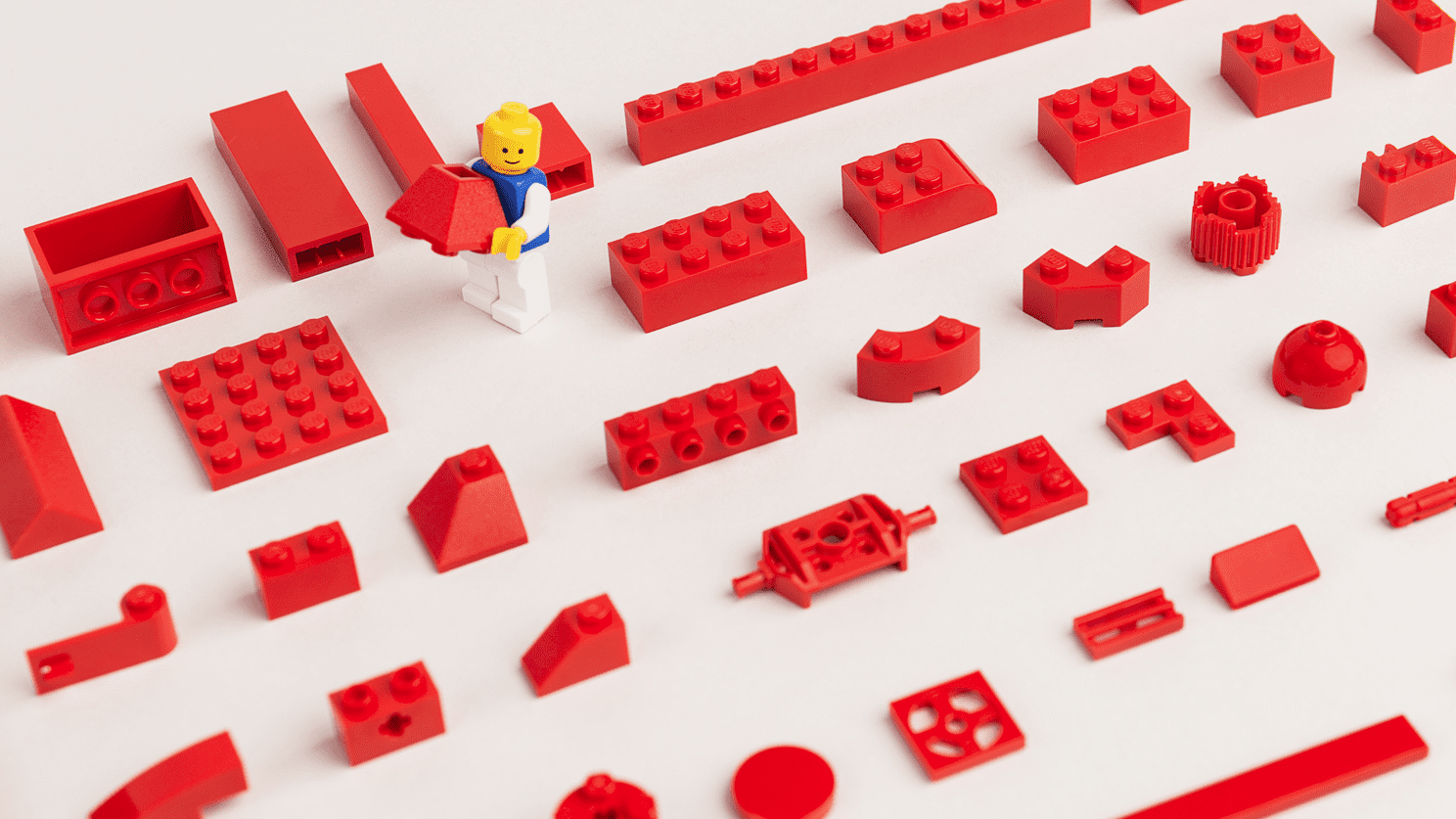
A design system is a collection of reusable elements that can be assembled together to develop new digital products, very similar to lego blocks. It’s a set of pieces that can be repurposed in nearly infinite ways as strategies, markets, and trends evolve. Here are some examples of those elements:
Foundations
Foundations are the visual elements needed to create an engaging end-to-end user experience. This compiles guidance on iconography, typography, grids etc.
Brand Guidelines
Brand Guidelines are often owned by the brand or marketing team and cover the use of the company logo, typographic, and colour palette guidelines.
Style Guides
Style Guides may refer to a visual style guide or an editorial guideline covering writing and tone of voice.
Components
Components are the interface and UI elements that make up a digital product, for example, buttons, form fields, radio buttons, and checkboxes.
Pattern Library
Pattern Library refers to the combination of components that are made up of elements from the design system. A common UI design pattern can define the colour, shape and style of a call to action button.
Best examples of Design Systems
Now that we have a better understanding of the basics we can all agree that Design Systems are crucial. Below is a list of some of the best examples of Design Systems that are great resources to learn how to create better user interfaces.
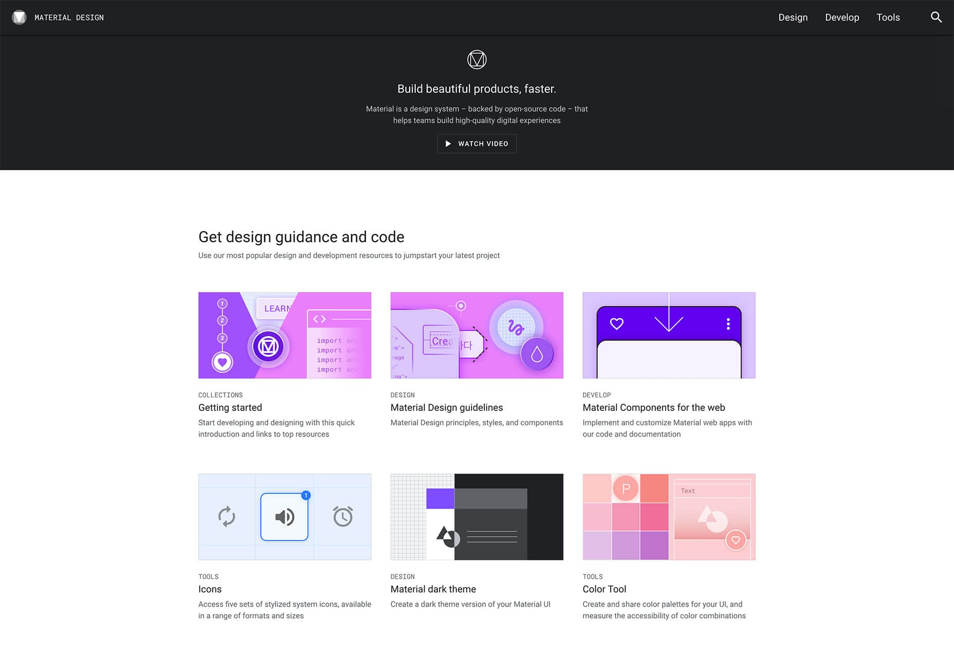
- Material Design by Google – This is one of the most popular DS out there. It’s been around for many years but is now used by many other developers and creators.
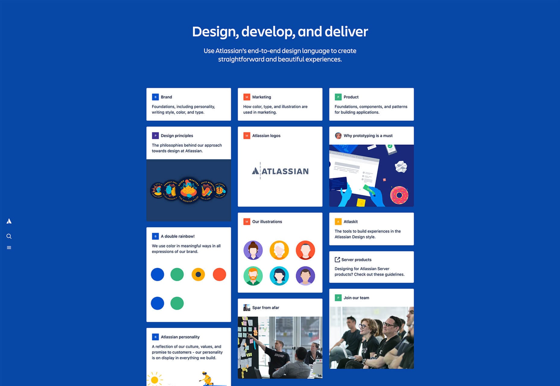
- Atlassian Design System – One of my favourites out there and the most complete Design Systems in the market. Used in real products made by Atlassian. The system is very detailed, you can also find the reasoning behind each choice made.
-
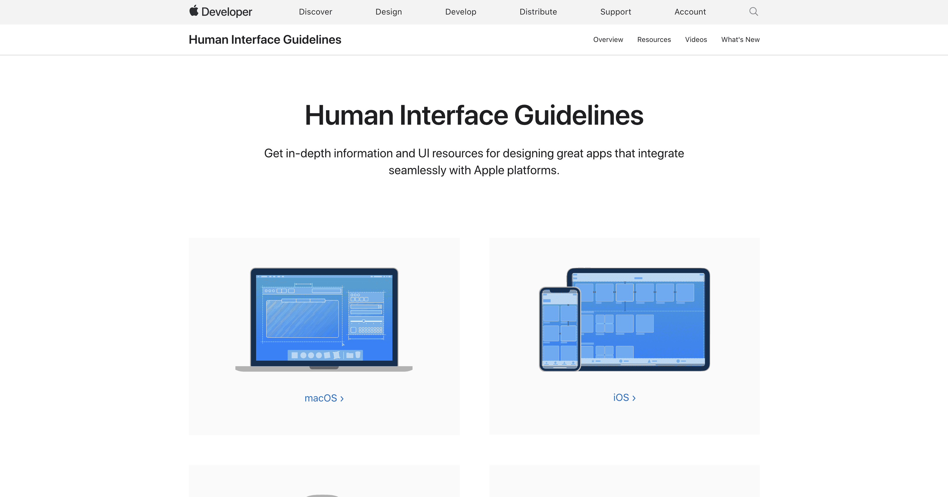
- Apple Human Interface Guidelines – Elegant and intentional design is in the very DNA of Apple. This is not only a Design System but an incredible resource full of downloadable templates and other guidelines that you can use on your own projects.
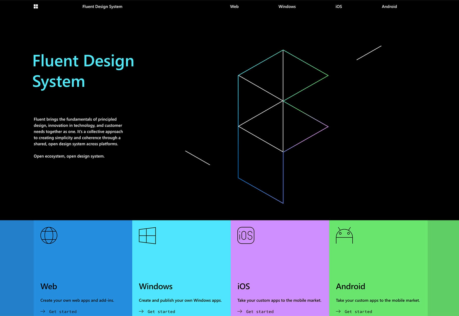
- Microsoft Fluent Design System – From the company both loved and hated in equal measure, Microsoft. This is a good example of design tools that can help you get the same look across all their products very quickly.
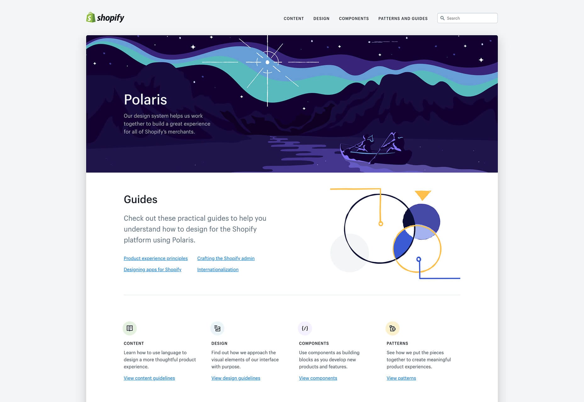
- Shopify Design System – The Polaris system includes all the building blocks needed to create apps without a steep learning curve. Plus, it also allows you to download a library of components, patterns, and style guides.
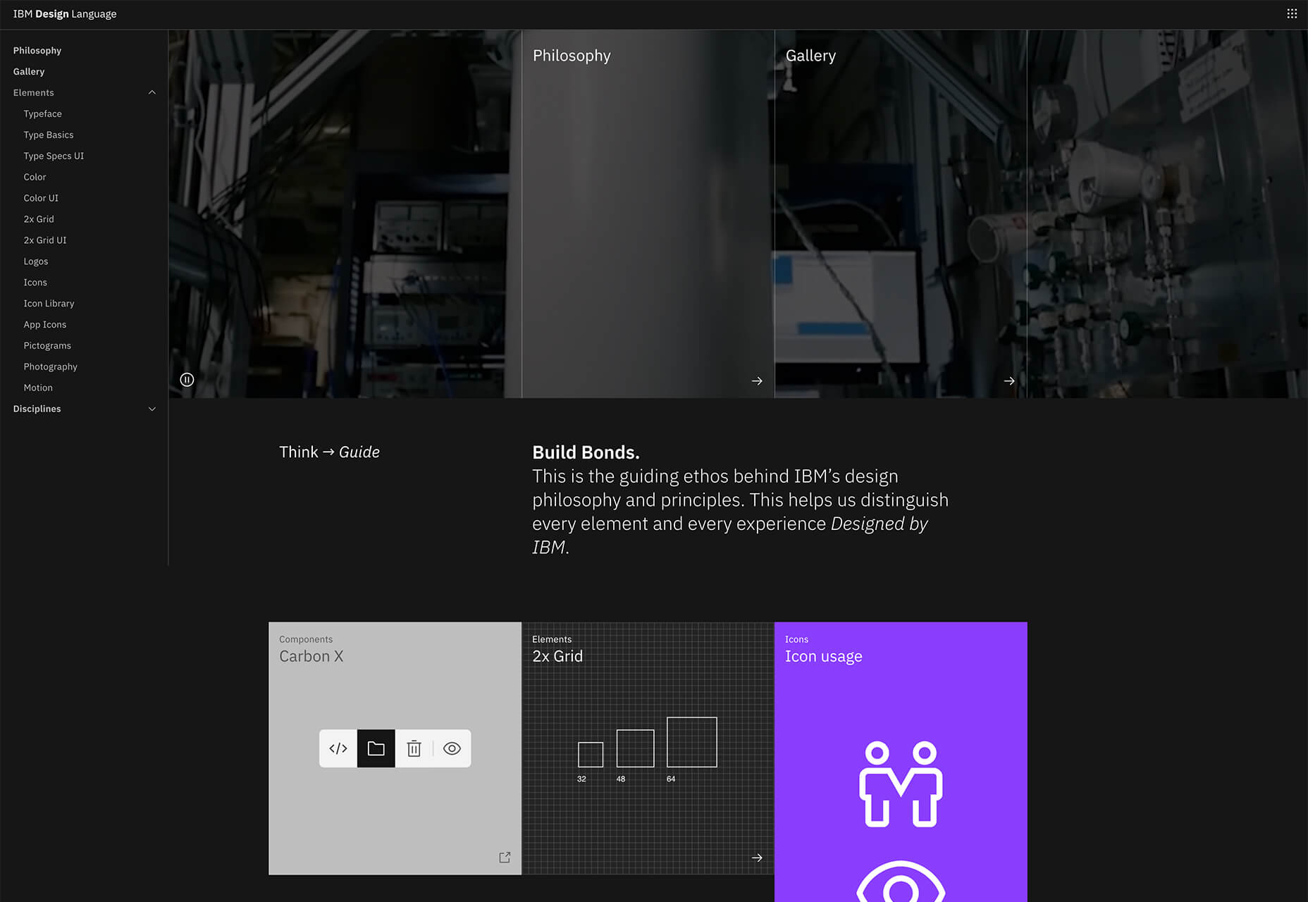
- Carbon – Made by IBM, this is a popular open-source design that provides a good set of rules and tutorials for creating high-quality design solutions. You can use this as a guide for how to manipulate heavy data in elegant and digestible ways.
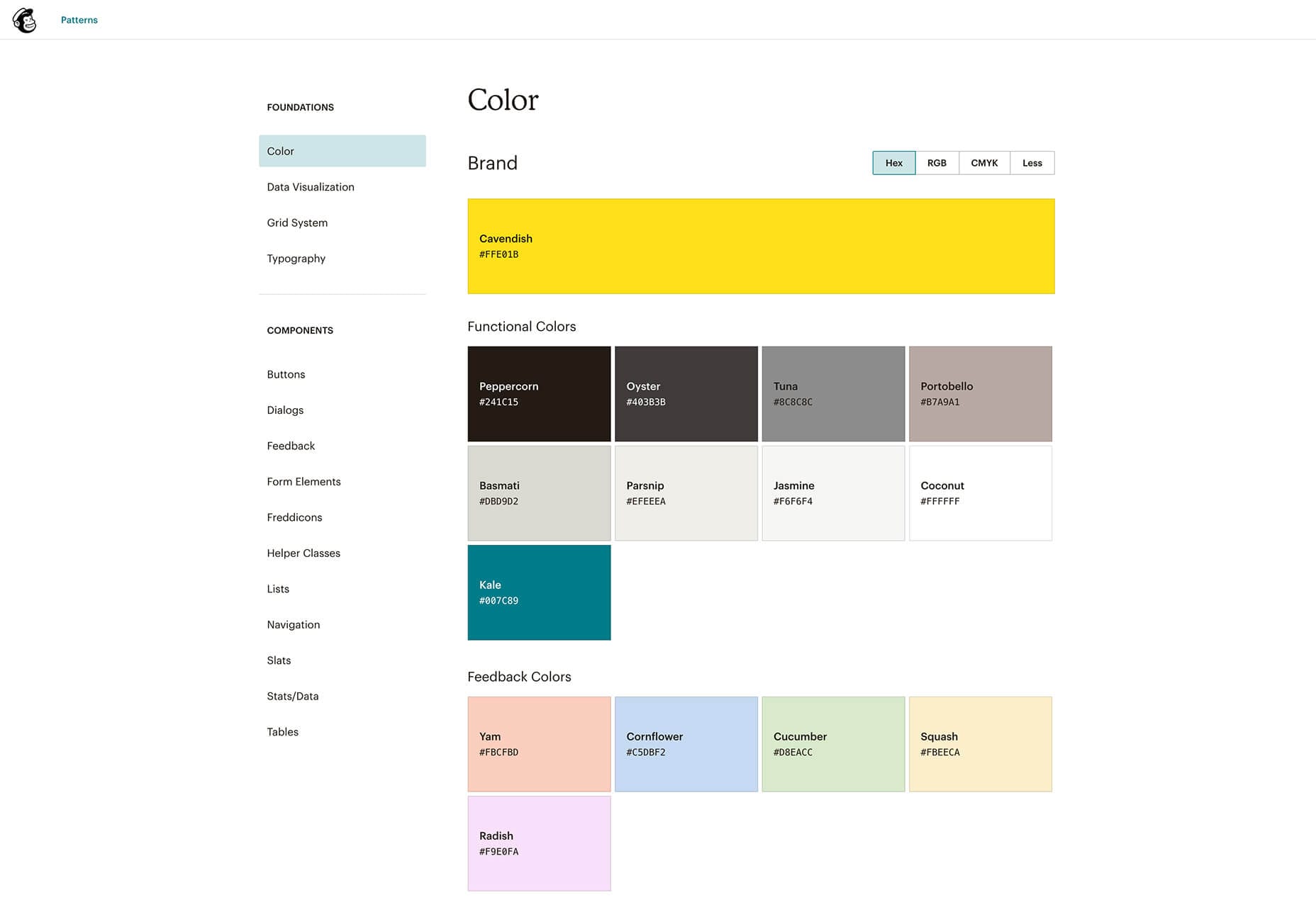
- Mailchimp – Having recently updated their identity, Mailchimp has been a long-time leader in what they do. A simple and very user-friendly Design System for a small business.
Why is a Design System so important?
Establishing a design system brings significant benefits to the product team. It promotes consistency, clarity, and quality in the design process. It can also bring significant competitive advantages to your company.
Let’s have a look at the many ways a design system can be a much-needed painkiller for your growing headache.

Reduce your design debt
It took me a long time to understand what design debt was, so here’s a simpler way to describe the concept: Design debt is all the good ideas or solutions that you skipped in order to reach short-term goals. It’s all the corners you cut during or after the design stage.
The more a business and its products grow, the more features get added to the original design, and old features become outdated. Without a design system, a product can lose its identity and start looking like a hot mess, creating a disjointed user experience.
Eliminates inconsistencies
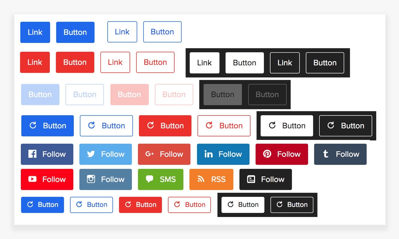
We’ve all seen those websites that have 10 different button styles, and asked ourselves ‘How could this have happened?’
This could happen faster than you might think. Creating standard components and using them repeatedly allows designers to create a more predictable and easy-to-understand product. This also allows us to spend more time developing a better experience and less time focusing on the style.
Saves everyone time
As with anything we design, it needs to serve the user. Working with an existing design system will allow us to combine flows and interactions as quickly as using LEGO blocks. Good design is a language, and when everyone speaks the same language, that’s when things get done faster.
Improves overall usability
When creating countless unique elements, their interactions increase, so does the cognitive load (the total amount of info a working memory can handle) and page weight (aka page size – which refers to the overall size of a particular web page, including all of the files that are used to create the page images, media etc.). This makes for a terrible user experience. It can also create conflicts on the backend, potentially breaking your product. By using a design system, you’re able to avoid these conflicts by building a library of components, which means you’ll spend less time in quality assurance.

Why do Design Systems fail?
Before jumping onto the design system bandwagon, make sure you have a strategy for how you’re going to tackle it from the beginning of the project to the launch of the product. Doing this will help you prevent creating a design system that could fail. Here’s a list of reasons why a design system could fail.
Not constantly investing in your Design System
You can work out intensely for 2 months and see some gains, but once you stop working out, the results will slowly fade away. So if you invest in a Design System but neglect to keep up with it, you’ll see an immediate impact, but that impact will fade as it gets out of sync with new designs. You’ll end up with strange, floating bits of code that nobody uses anymore, your pattern library will get out of date, and then you’ll find yourself investing more time and energy than you should. It’s really important to remember to have a solid core at the beginning of the project.

Communication is key
Communication between teams and partners is a must, the design owner must act as a bridge between designers and developers so there’s no confusion and everyone knows what they’re doing.

Effective buy-in
One of the biggest reasons design systems fail is the lack of commitment and buy in from everyone in the company, top-to-bottom.
The best way to build excitement about the adoption of a Design System for your company is to show its value and worth, seen through its ability to help teams work more efficiently as well as scale production.
Don’t ignore your users’ needs
It’s very easy to get excited about getting started and introducing a design system to your product but it’s also very easy to get caught up in the excitement and forget about your users’ needs.
For a design system to succeed, you need to involve the users from the beginning. Failing to do so could lead to a design system that doesn’t align with user preferences.
User testing
User Testing is the barometer that tells you how well your design system is functioning and what changes you need to implement to make it better.
It’s effective because you get feedback directly from users. This ensures that your design system is updating according to user needs and that leaves fewer chances for failure.

Is it possible to implement a Design System in a developed product?
One of the most challenging parts of a product is to incorporate a design system in an already developed platform. At its most basic level, if properly implemented, a Design System will provide a distillation of best design practices and processes that their teams can utilise to maintain consistency across their products.
It’s never too late to start thinking about your product in this way, but when it’s too late, it’s really too late. By the time you’ve scaled, it will take exponentially more resources to undo mistakes that are now ingrained into your product. So the earlier your start thinking about implementing a design system, whether big or small, the better the process will be.
Start early, update often. Design systems can be built retrospectively but it’s easier to do it when a new product is being built.
Wrap up
As many digital products constantly grow and change, so should your branding, message, and ultimately your Design System. The consistency gains make the time and effort dedicated to the process of building one a successful investment.
If you don’t have a design system in place for your business, you could be losing users because of it. Get in touch with us about building a better digital experience for your users today.
