Website Accessibility is often seen by many as a dark art, overly technical, and difficult to achieve compliance. It really doesn’t need to be that complicated. I’m going to use this article to try to demystify accessibility so anyone can understand it and take the appropriate action.
The European Accessibility Act (EAA) is on the horizon, and it reminds us of the arrival of GDPR back in 2018. Nothing like a deadline to focus the mind. Soon, everyone in the industry will be scrambling to make their digital products more accessible.
It’s important to remember that good accessibility benefits everyone, not just those with disabilities. We need to get out of the mindset that accessibility is being imposed on us and start looking at the benefits it brings to all users and website owners. Good accessibility is good UX and good for conversions.
Imagine visiting a website where text blends into the background, buttons lead nowhere, and forms leave you guessing what to enter. Very frustrating for anyone. Now, consider how much harder this becomes for someone with a disability.
For years, the websites we design and develop at Friday have met a high standard of accessibility. Our team of designers and developers all strive to push the standard of our work to be more inclusive and meet WCAG guidelines. We’ve seen firsthand through our work how fixing common issues— like low-contrast text or missing alt tags— can transform a website in terms of usability and performance.
According to the WebAIM 2024 report on the accessibility of the top 1,000,000 website home pages. 96.4% of all accessibility errors detected fall into these six categories:
-
- Low contrast text
- Missing alternative text for images
- Missing form input labels
- Empty links
- Empty buttons
- Missing document language
Let’s unpack each of these in simple terms without getting too technical around how to achieve compliance.
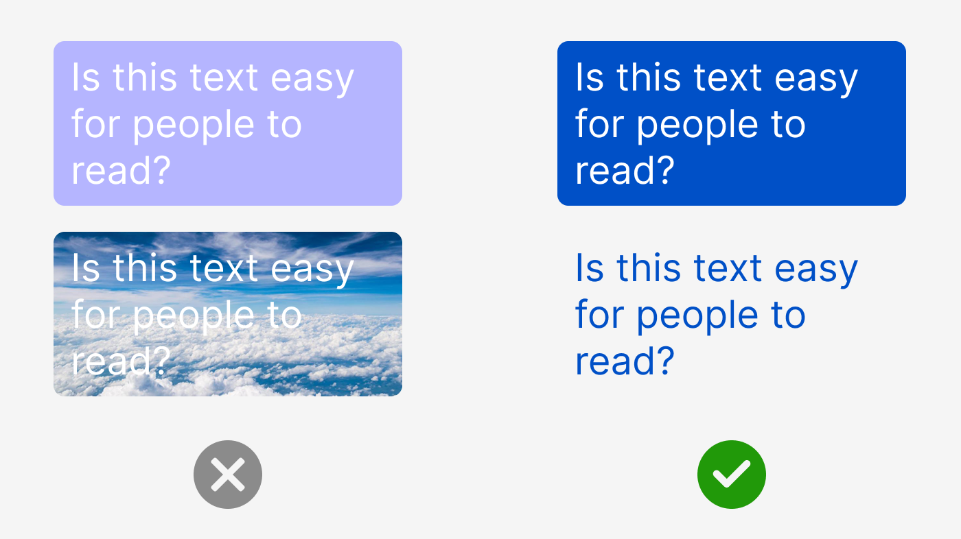
1. Low Contrast Text
When text blends into the background, it becomes difficult to read for everyone, especially users with visual impairments. Improving contrast ensures your message is clear and easy to read for all users. Think bold text on a background that lets it stand out, and avoid placing text on top of images or videos.

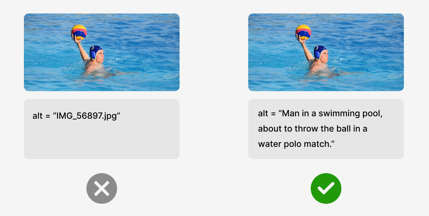
2. Missing Alternative Text for Images
Alt text, a concise description added to images, serves as a visual cue for screen readers as well as providing context when an image fails to load. This helps users comprehend the content within an image. Without alt text, these users may miss crucial information. Incorporating alt text is a straightforward process that enhances the inclusivity of your content.

3. Missing form input labels
Form fields without labels can confuse all users, especially those relying on assistive technologies. A clear label like “Your Name” or “Email” makes forms easier to navigate and increases the likelihood of getting submissions. When the label is added within the field as placeholder text, it disappears as soon as the users types into the field, this can cause issues.

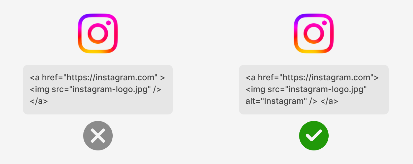
4. Empty Links
A link (text or image) with no text or context can be problematic, particularly to those using screen readers, which might just say “link” with no explanation. For example, it might be a social media icon, but there’s no information about its purpose. For users who rely on screen readers, the link is essentially invisible because the screen reader can’t tell them what the button is meant to do.

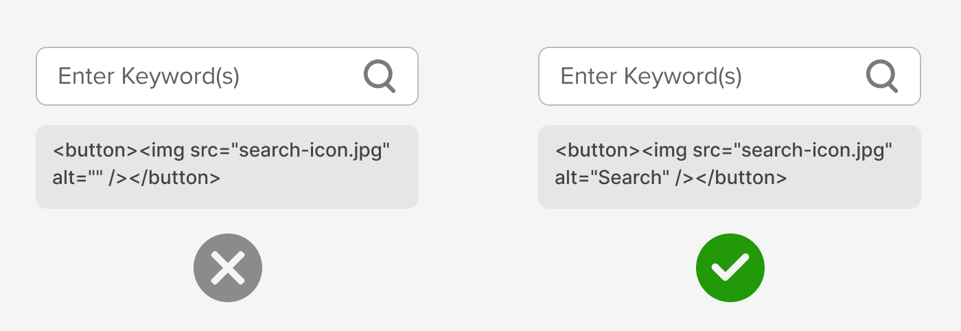
5. Empty Buttons
Similar to empty links, an empty button is a button on a website that doesn’t have any text, label, or description to explain what it does, rendering it invisible to screen readers.

6. Missing Document Language
The source code of a webpage should indicate the language setting (e.g., English, French) so screen readers can pronounce words correctly. Without it, users relying on these tools may hear a jumbled or inaccurate interpretation of your content.

Thats it, if you get these 6 things right you will have covered 96.4% of all accessibility errors detected across the top 1,000,000 website home pages. Your website will be more inclusive and user-friendly and will stay ahead of the upcoming European Accessibility Act in June 2025.
There are many tools out there that will scan your website for issues like these; WAVE has proven itself to be very effective but will not catch everything, testing also needs a human touch. At Friday, we couple automation with hands-on testing using actual screen readers for a more comprehensive view.
Accessibility isn’t just a compliance checkbox; it’s a commitment to providing equal opportunities and experiences for everyone who visits your website. Good accessibility will also boost your site’s usability, search rankings, and audience reach. More importantly, it’s a chance to lead by example in creating a web that works for everyone.
With good accessibility, the small changes create a big impact. Start today by reaching out to us for a website accessibility audit.


