
Web accessibility is all about inclusivity. It’s the idea that everyone, regardless of limitations, should have the same opportunity to view content on the web like everyone else. These limitations include visual, auditory or physical disabilities. Making your website accessible will become ever more crucial in 2021.
Although building a site that fully caters to these limitations is a time-consuming process, there are a few easy wins we can do that will make using the website a bit easier for users with disabilities.
“The power of the Web is in its universality. Access by everyone regardless of disability is an essential aspect.”
– Tim Berners-Lee, W3C Director and inventor of the World Wide Web.
Why Web Accessibility will be crucial in 2021
In 2019, Dominos lost a lawsuit to a blind man who was unable to order food on their website or mobile app even though he was using a screen reader. Although a huge win for disability advocates, it’s a warning sign for companies that if your digital platforms are not accessible enough then you could face legal repercussions.
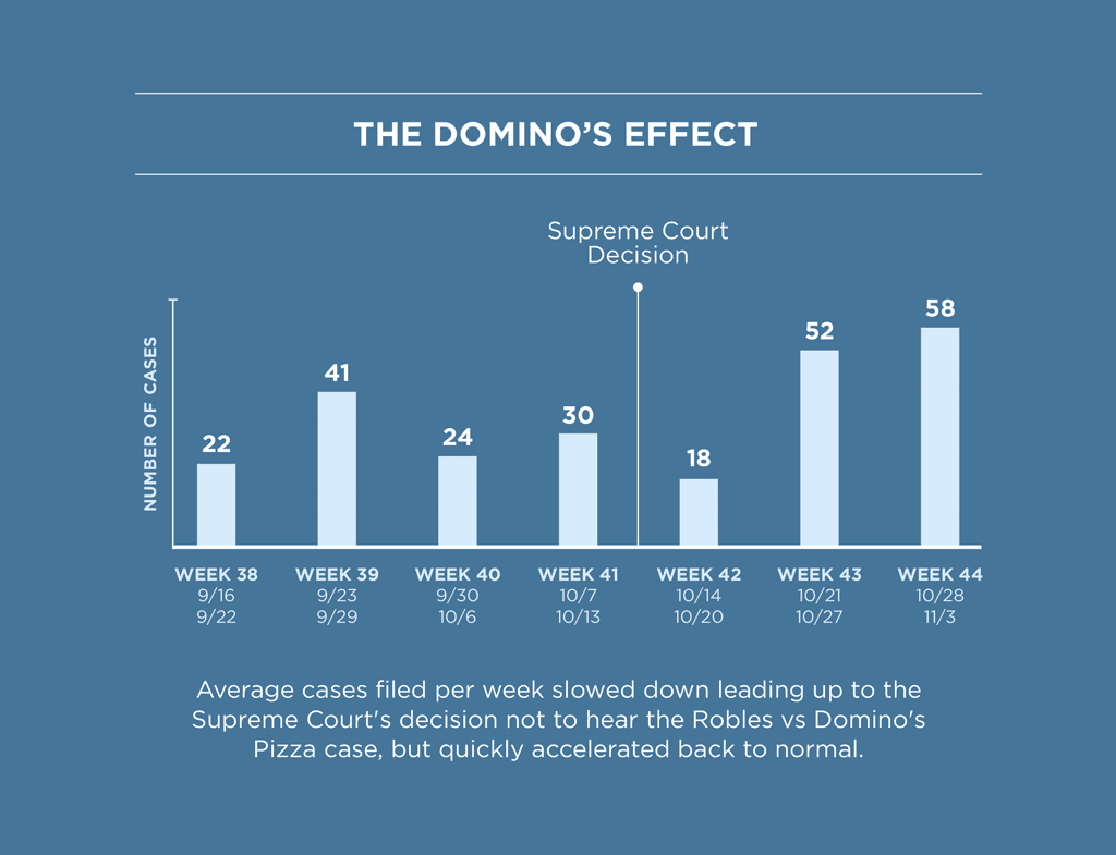
Web accessibility court cases slow on the lead up to the Dominos case, then quickly increases afterwards.
Ireland, among other EU entities, currently only require public sector websites to meet a specific accessibility standard but this is likely to extend to other sectors in the coming years.
Regardless of the possible legal repercussions of your site not being accessible, you’re simply losing out on revenue by not including some level of accessibility.
In a survey, it was determined that 71% of web users with disabilities will leave your site if it’s too difficult for them to use. 82% are willing to pay more for the same products if the competitor’s site is more accessible.
It can be very difficult to meet full compliance with all web accessibility rules unless a website is specifically designed to do so. However, following the points below can help your site reach some level of web accessibility.
Good Colour Contrast
When we talk about colour contrast in the context of a web page, we are talking about the colour difference between the colour of text and the background colour that appears behind it. Having good colour contrast on your web page ensures all users, even those who are visually impaired, will be able to read the page’s content with ease.
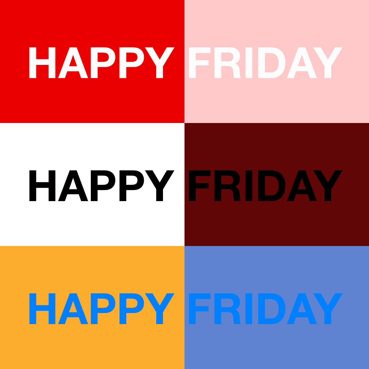
A classic example of good colour contrast, and one you will see most commonly around the web, is black text on a white background. An example of bad colour contrast is having light grey text over a white background.
As a general rule, you want a dark colour over a light colour or vice versa.
Good contrast left VS Bad contrast right
A common issue with colour contrast also arises when text is shown over an image. The background image could have all sorts of colours resulting in some words in the text having food contrast, and others having bad contrast.
You can check if two colours have good enough colour contrast for visually impaired users by using a comparison tool like the one on WebAIM (Web Accessibility in Mind).
Add Alt Text on Images
Image alt text is used to describe an image on a web page. It’s the text equivalent of the image. Aside from some SEO benefits, alt text can also be read by screen readers which visually impaired users would be using to read out aloud content on a web page.
If an image does not have an alt text, screen readers cannot determine what the image represents which can be detrimental for visually impaired users if the image holds strong significance in the context of the webpage.
When a screen reader comes across an image without alt text it will either skip over the image entirely or try to read out the image URL, which wouldn’t be great if the image file was called something like my-image437829403728.jpg!
There are a few important points to take note of when writing alt text for images:
- Alt text should be concise. Aside from a few rare cases, alt text should be no longer than a single sentence.
- If the image is purely decorative (like a background image) then alt text is not required as it holds no significance in relation to the content of the web page.
- Avoid using phrases like “An image of…” or “A picture of…”. If it’s being added to alt text, the implication is that it’s being used to describe an image so adding that extra wording is redundant.
For example, in the image below we can see it’s a picture of an avocado. Simply setting the alt text as “Avocado” would be considered bad alt text. For good alt text, we’d need to describe the scene in more detail, something like “Avocado cut in half on a chopping board beside a knife, with oranges in the background”.

“Avocado cut in half on a chopping board beside a knife, with oranges in the background”
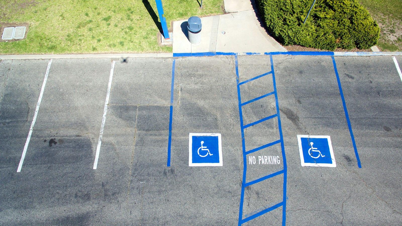
Don’t Rely on Colours Alone to Convey Information
There are many types of colour blindness which can affect people’s ability to perceive low contrast colours, getting certain colours mixed up, or simply not being able to identify a colour at all.
If we rely too heavily on using only colour to convey information, we make it very difficult or impossible for a colour blind user to get that information. To get around this, it is best to use a combination of colour, text and icons to get our information across.
For example, on Google Maps Traffic map, non-colour blind users can clearly see the red and green lines which we would correlate with fast traffic and slow traffic.
If we use Sim Daltonism, a tool used to imitate how a colour blind user would view a webpage, trying to figure out the information the map is trying to tell is much more difficult to interpret.
What Google has done right is to add a legend to the bottom of the map. Now, even if a user can’t perceive the red and green lines, they can use the legend at the bottom of the map and determine which shades of contrast mean fast or slow traffic.
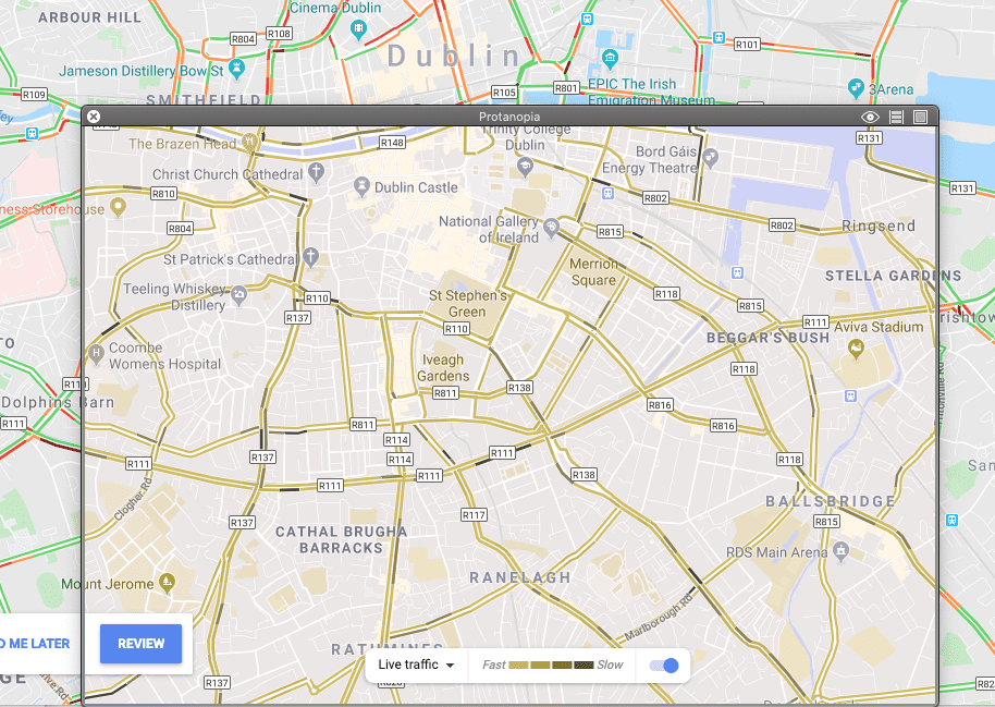
Google Maps traffic with Protanopia colour blindness
Use Logical Page Headings
If you’ve ever used a text editor you may have noticed that in the text format dropdown there are a bunch of numbered headers, Header 1, Header 2, Header 3, etc… It may come as a surprise that those numbers mean more than applying different font sizes to text. Screen readers and assistive technologies use them to navigate around the page and to determine what the page is all about!
Because of this, it’s important that those headers are organised in a way that makes sense in the context of the web page.
The most important heading is the <h1> (Header 1) tag which should state the topic of the page. There should only be one <h1> tag per page.
Headings that are higher or the same tag level indicate a new section. Headings with a lower rank indicate a subsection. Skipping tag levels should be avoided if possible.
In the screenshot below we see the page is about Music Genres and a <h1> is used. We then have a section about Rock music (<h2>, Header 2) which also has subgenres of rock music, glam and blues (<h3>, Header 3).
The next title is Jazz, a <h2> tag and is higher than the previous <h3> title; it tells us that Rock section is finished.
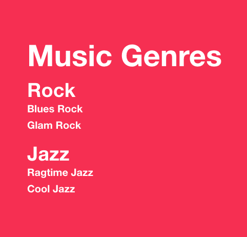
Music genre header hierarchy
Web Accessibility Benefits Everyone
It’s very likely you have, in some way, benefitted from something that was originally intended to cater specifically for people with disabilities.
SMS texting was originally intended for deaf people to communicate in lieu of the telephone, automatic doors and stair ramps for people with physical disabilities, and typewriters (and in turn, keyboards) for blind people to write without having to scribe letters.
Good colour contrast can help reduce eye strain. Users with bad internet connections who can’t load that 2MB image benefit from alt text on images. Users who have monochrome screens to increase productivity and fight screen addiction benefit from conveying information with more than just colour. Logical page headers help with quick page comprehension.
When designing for inclusivity, it doesn’t just benefit those with disabilities, it can benefit everyone.
Conclusion
According to the Accessibility Guidelines Working Group (AG WG), it is not recommended in general that a website meets the highest level of accessibility conformance as this greatly affects design and functionality, and in some cases may not even be possible.
That being said, it’s still important to try to make the web a more accessible place and hit those accessibility conformance goals whenever possible.
With the stricter accessibility requirements regime for the public sector being introduced in both North America and the EU, no doubt similar requirements will eventually become the norm.
In a survey by WebAIM, only 40% of 1224 users think that web accessibility has improved. 72% think this is due to a lack of awareness or lack of accessibility skills/knowledge. In the 2019 Frontend Tooling Survey, of 3005 developers surveyed, 63% don’t use any tools for accessibility testing.
Although web accessibility has been gaining more awareness over recent years, it’s clear that in many cases, web accessibility is merely an afterthought or not considered at all.
Research has shown that this can be a costly mistake as 82% of online shoppers with disabilities will happily pay more for products if your website is more easily accessible than cheaper alternatives. This doesn’t just increase revenue, it increases brand loyalty.
If a web user has any sort of disability, right now it’s a roll of the dice whether they’ll be able to fully or partially easily access the functionality or information of a website. As web accessibility awareness grows we’ll hopefully see the web becoming a more inclusive place.
Jonathan is a UX Developer here at Friday. Since graduating from IADT with a BSc (Honours) in Computing Multimedia Systems & Web Engineering, he has been passionate about improving and expanding his skill set in all things web development.