Let’s be honest – most web users don’t like filling out forms, but they are crucial to the way we interact online.
Forms are an important part of user experience and are often directly attached to business goals and conversions like buying something, signing up for a newsletter, registering for an event or submitting an enquiry.
I often run into websites, apps and pages that get everything right and then fail at the last hurdle with their forms.
It is so important to remove friction from the process and guide the user in a way that makes the experience as user-friendly as possible.
So I want to give a few tips and demonstrate the best way to validate, handle errors and ultimately increase conversion.
1. Instant negative feedback
I find it quite frustrating seeing all those red input fields when a form submission has errors. I would recommend saying something nice rather than pointing what’s wrong from the outset.
DON’T
…tell the user they are wrong from the very first moment they start filling out the field. Email fields are a common example, it comes across as a bit rude saying that you have incorrectly entered your email address when you haven’t finished typing.
DO
…say something nice instead. Perhaps use a green border, a tick next to it, or even a little message.
2. Immediate feedback
The timing of validation is very important. With only a few tweaks the form suddenly seems much more intelligent. I would suggest initial validation when the user has moved the cursor from the field.
DON’T
…tell the user the field is correct when they are still typing. It’s much better to let the user signal they have finished.
DO
…wait until the user tabs or clicks onto the next field. After that you can provide them with positive or negative feedback.
3. No feedback when I update a field
There is one exception where immediate feedback validation is not the best practise. It’s when the field has already been validated and the user decides to change the text they input. In this case I would recommend giving feedback immediately.
DON’T
…ignore updated input text, for example, if there is already a feedback message displayed it might not update once the user has edited the field. Take phone numbers for example:
DO
…update the feedback once the field has been edited.
4. Unhelpful error messages
If validation fails, the application should provide a clear, short message containing ways to correct the errors. Clearly indicating which fields have errors is essential. Here you can provide intelligent response messages that disappear when the requirements are met.
DON’T
…let the user guess what’s missing.
DO
…help the user fill out the form correctly. Here’s how instant feedback can indicate whether the user has created a strong enough password.
5. Confusing server side validation
Server Side validation should always be done, as it is very important for security reasons. Client side validation can be bypassed by hackers. Sometimes a form will spit back error messages that are unclear, try to make them as accurate as possible.
DON’T
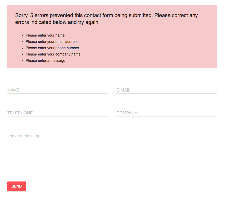
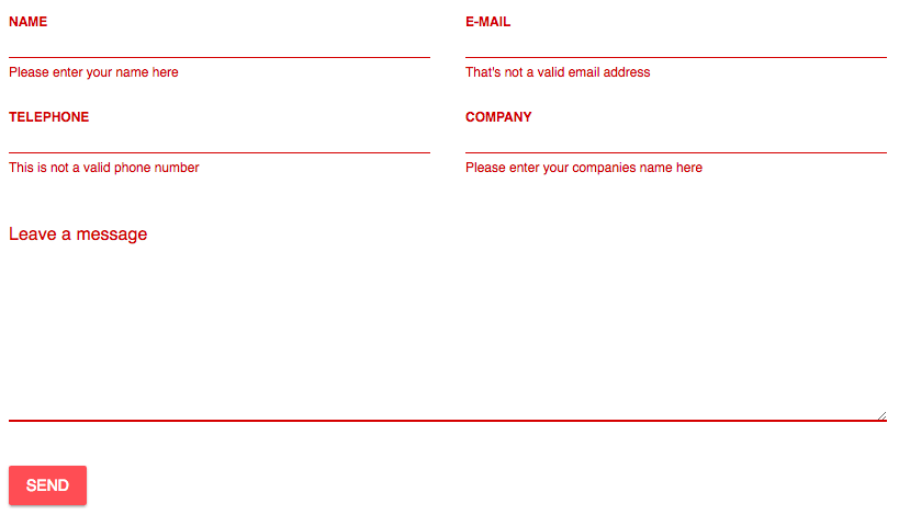
…provide unclear error messages, where the user is not sure which field is wrong.
DO
…give the user some hints next to the field how to fill it out correctly.
When designing registration forms, keep in mind that they are for the user and the smoother the registration process, the more delighted your customers will be.
If you need help with form and conversion optimisation get in touch with us, we are happy to help 🙂
[ratings]


