User experience for mobile – take care of your audience
User experience (UX), a term that hasn’t been used widely in the past, is now EVERYWHERE.
A frequently overlooked aspect of design is the good old user interface. Whether intuitive or ridiculous, interfaces are everywhere. On our TV sets; in the cockpits of airplanes; on the watches we wear on our wrists and more obviously, on the websites and apps we engage with daily.
Why is it likely to find a disheartened user behind the interface of a mobile website? Well it’s early days… we have a way to go before we get it just right. But it’s our job as designers to challenge the current issues with mobile web design while thinking of new solutions to offer you a quality user experience. Take care of your mobile audience by considering the following points.
Declutter the mobile user experience
Prioritise your content. Obvious, sure but it can’t be overstated. Sidebars for ‘filling in the gap’ extraneous items become a thing of the past. Anything that does not help the user to achieve their main goal can be removed completely, or placed further down the page if absolutely necessary. Hide the non-essential info. You can still keep hidden information accessible using a feature (like a dropdown menu or accordion feature) that allows the user to expand & collapse the goods upon request.
Your content is key but analyse your potential customer & choose the essential bits for your mobile site. Place the most significant info at pole position. Every business has a purpose so it’s important to make this instantly clear to your visitors.
I most often use my phone to find a company’s contact information on the run so ensure your details are easily available. They don’t have to be flashing & jumping up & down at the top of the screen, but they should be accessible within a click or two from the main navigation.
Speed matters
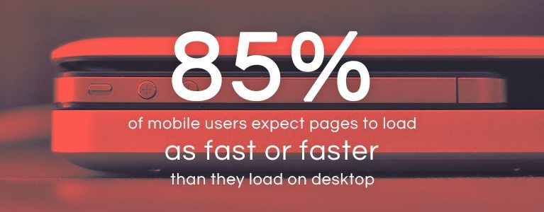
A mobile site’s performance matters to everyone, and these days we expect a website to load within a couple of seconds. We’re all familiar with the sense of frustration that comes when trying to access info quickly on our phone, resulting in visions of it smashing to pieces against the nearest wall. Don’t push potential customers to other sites that load faster. Ensure your website has the best loading speed (learn how in this blog post by Ziggy on the subject).

Handling navigation is one of the most challenging aspects of responsive design. The burger menu is now globally recognised and is widely used in mobile design because it is an environment where each pixel counts, due to smaller screen sizes and is essential for navigating content on any mobile screen.
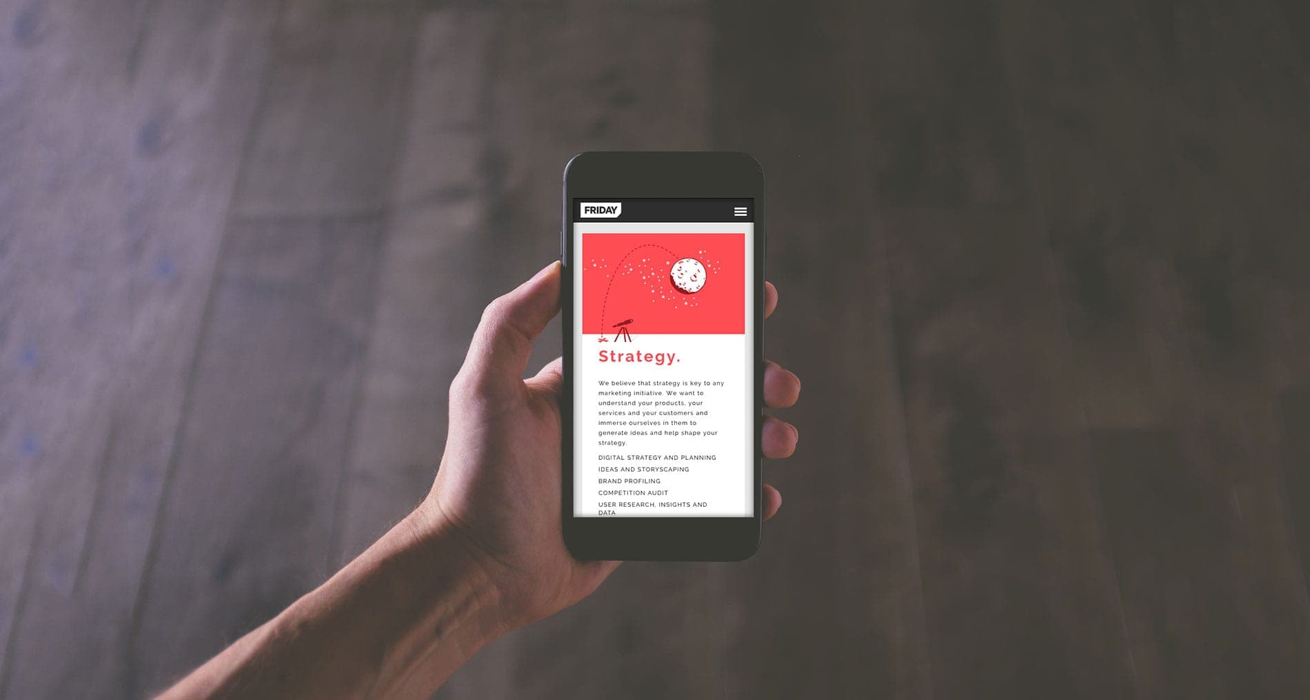
Keeping the burger menu visible at all times (i.e.: by initiating a ‘sticky’ menu) provides maximum accessibility to your navigation and is highly recommended (try out FRIDAY’s sticky menu for size from your mobile now).
Use margins of at least 10 pixels on either side when displaying text to maximise space usage on a mobile device. Large headings will make it easier for the user to scroll up & down and scan the page to digest only whats relevant if there is alot of content. Consider too the fact that you will most likely have to increase the size of buttons & clickable areas and space out text links, to compensate for our sometimes fat and clumsy fingertips instead of the precision tip of a cursor.
It goes without saying that the best designs are very carefully considered. But remember there is no such thing as a perfect UX because there is no such thing as a perfect human being. Don’t worry about making your mobile app or mobile site perfect. Instead put the effort into always making it better. If we’re constantly making it better, we’re going in the right direction.
If you’re interested in finding out more, check out the video below on optimising mobile user experiences by a nice guy called Luke Wroblewski.


