The UX audit process is invaluable in identifying where your site might be falling short on a number of different usability categories.
Throughout the years, we’ve seen many websites that could use a little TLC. From e-commerce platforms to simple landing pages, we’ve seen it all.
Though useful, a UX audit isn’t a replacement for in-depth user research. So just to note, a deeper research strategy involving user interviews and usability testing is always going to deliver more fine-tuned results for improving your UX overall.
In no particular order, here are 10 of the most common issues that we’ve been seeing consistently over the years.
1. What Are You Even Selling?
You wouldn’t believe how often we find ourselves asking a new client, “What exactly do you do?” upon reviewing their website for the first time.
It’s easily explained in conversation, but the content on the site isn’t delivering the same message. When your primary business touchpoint leaves visitors confused, that’s a big issue.
Getting your USP across clearly, along with a strong Call to Action can be difficult, but it’s essential. These elements communicate why a customer should choose you over a competitor, and without them, your website isn’t as effective as it could be.
2. Clickable and Non-Clickable Elements
When navigating a website, it should be really obvious what I can click on, and what I can’t. If a piece of text is blue, I’ll assume it’s a link. If it looks like a button but doesn’t do anything, I’ll probably think something is broken.
One of the most common issues we come across is when interactive elements are styled inconsistently, or ineffectively. What’s extra frustrating is when two elements are styled the same, but only one of them is clickable. Avoid confusion by establishing a standard style for buttons and links and sticking to it.
3. Inaccessible Color Contrast
Without fail, the audit process will highlight content that doesn’t pass the minimum required colour contrast for accessibility purposes.
The Web Content Accessibility Guidelines (WCAG) recommend at least a 4.5:1 contrast ratio between text and its background colour, so that visually impaired individuals can read it. It’s easy to remedy once you know what to do—there are tools that can check your contrast in seconds.
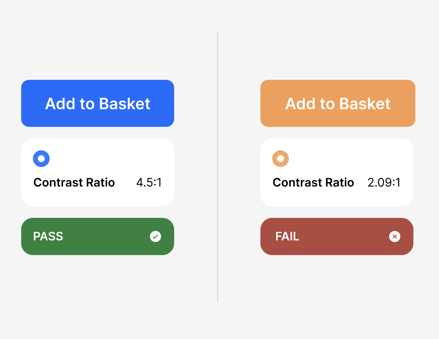
The problem usually arises when companies use their brand colours for text or page backgrounds. While brand consistency is important, not all colours work for text. Lighter tones, in particular, can fail to provide adequate contrast. It’s time to address how colour is used on your site, particularly with the EU Accessibility Act on the way.
4. Trust-building
It should be easy for users to see that your services are trustworthy. Here are a few simple ways to build trust that are often overlooked.
- Testimonials and Case Studies: Real stories from real people give your brand authenticity. Showcasing actual benefits that your existing customers have experienced will help potential clients feel more confident in your services.
- Recognisable Clients: If you’ve worked with big-name clients, let the people know! Displaying their logos on your homepage can significantly boost your credibility. However, only show logos that add value—showing a bunch of logos that aren’t recognisable can actually do more harm than good.
- Show the Team Behind the Business: Too often a site will give no inkling at all that there are human beings behind the operation. People relate to other people, so seeing a human face is always a positive. Introducing your team and providing contact details is a great way to quickly establish a relationship with users.
- High-Quality Imagery: Blurry, low-resolution images send the wrong message. Invest in sharp, high-quality visuals to leave a positive impression.
5. Poorly Curated Imagery
Speaking of imagery, there’s more to consider than just resolution. Overusing images with text overlaid on them can create a host of problems. When scaled down for mobile, the text can become illegible or cropped out of frame. Plus, they’re not accessible to screen readers, and they often add unnecessary cognitive load to the page.
And, of course, steer clear of overly stereotypical stock photos. You know the kind. Your imagery should represent your brand, not just fill a space.

6. Lack of Consistent UI Elements
A website that feels disjointed can really impact a user’s first impression.
Having too many CTA styles for example, can confuse users when trying to navigate your site. The less thinking about where to click next, the better the user experience overall.
Surprising users with inconsistent elements from page to page isn’t just frustrating—it’s preventable. A well-curated component library can ensure your website maintains a consistent, high-quality appearance at every touchpoint.
7. White Space Is Not the Enemy
Many websites fall into the trap of cramming information into every available space. It leads to an overcrowding effect, and what we call ‘high cognitive load’ for the user. The less brain power needed to understand something, the better, ie. “less is more.”
So negative (blank) space is your friend. It allows your content—and your users—to breathe. One of the most common issue identified is a lack of adequate padding between elements on screen. Less clutter means a clearer message.
8. Mobile Optimisation
It’s obvious when a site has been designed desktop-first, and little consideration was given to how users interact on mobile.
Mobile users are often left struggling with tiny buttons that are impossible to tap or lacking key information that was designed to be revealed with a mouse hover.
Around 60% of all online activity now happens on people’s phones, so it’s vital that you don’t neglect your mobile experience. Your customers will thank you for it.
9. The Dreaded “Learn More” Button
Ah, the classic “Learn More” button. It’s the bare minimum for a button to tell you what to expect when it’s clicked, and ‘Learn more’ just doesn’t do enough. And don’t get me started on “Click here to Learn More”—that’s not helping.
Your CTAs should offer context and set clear expectations. Think of them as an invitation to your user. If they know what to expect, they’re more likely to click.

10. “An Error Has Occurred!”
We’ve all been there: you get an error message that simply says, “An error has occurred!” Okay? What caused it? How do I fix it?
Too often, an error will tell me nothing more than the fact that it occurred. Error messages should provide clear, actionable information, ideally in layman’s terms. If there’s a way to rectify the issue, let the user know, or provide contact details of someone who can help.
Similarly, don’t leave users hanging after they’ve submitted a form or saved changes. A simple and often omitted success message can confirm that an action was completed successfully, and prevent any unnecessary confusion.
Low-Hanging Fruit
The UX audit process uncovers all the issues you may not have realised were there, from the low-hanging fruit to the deep-rooted problems holding your business growth back. These are just the most common issues, there’s a lot more to consider overall, and it’s always unique to each business and its audience.
If you’re interested in us taking a look at your website, get in touch. It’s a quick and easy way to improve on your general user experience. Remember, your website is often the first impression potential customers will have of your business. We can help to make sure it’s a good one.