Negative feedback often gets a bad rap, but in the world of user experience (UX) design, it’s a goldmine of opportunity.
By embracing negative feedback, we can turn pain points into powerful improvements. This is a common UX practice, but sometimes it’s hard to explain the impact of user feedback in terms of digital spaces.
I recently encountered a real-world example of how using negative feedback to create a more positive user experience can increase foot traffic and conversions.
Background
A photography gallery in Vancouver, The Polygon, prides itself on inclusivity and being a “welcoming, barrier-free space for everyone.”
However, an ongoing exhibition, featuring “52 monitors, loud clashing sounds, and fast-moving video footage in a densely structured environment” revealed a clear accessibility issue.
Evidently, visitors must have provided feedback about the sensory overload, prompting The Polygon to acknowledge and address the problem and present a solution.
The Problem
The immersive experience was causing sensory overload, making it overwhelming and inaccessible for some visitors. This resulted in individuals with sensory sensitivity being unable to attend the event, leading to a misalignment between the event and the gallery’s positioning as an all-inclusive space.
While the exhibition is free to enter, donations to the gallery after visiting are optional, so this issue will likely result in a loss of potential donations.
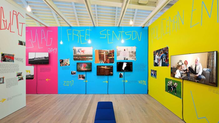
The Polygon Gallery, Vancouver – Velvet Terrorism exhibition
The Challenge
How do you lower the sensory impact of an intentionally disruptive exhibition without compromising its integrity, so that more people have the option to visit?
The Solution
Reduced Sensory Day: A special day dedicated to reducing sensory impact by slightly lowering the volume.
What to Expect: The gallery shared an update which details exactly what can be expected at the exhibition, flagging potential sensory issues and displaying images from inside. This allows visitors to make informed decisions and prepare accordingly.
Sensory Support Resources: Providing noise-reducing ear covers and other support tools such as stim/fidget toys and sensory-calming cards. Designated areas allow visitors to take breaks from the sensory intensity.
Online Access: For those unable to attend, digital access to exhibition content is available.
The Outcome
By actively seeking and addressing feedback, The Polygon enhanced its visitor experience, making the exhibition accessible to a broader audience and realigned its brand identity with its user experience.
And, by making the exhibition accessible for more visitors, will likely have received donations from visitors that returned for the improved experience.
“What users do, and what they say they do, don’t always match up.”
In-person vs. Digital Feedback
This is a simple example of how gathering user feedback, good or bad, can have a positive impact on any business. In this case, the feedback was likely freely given by visitors who were unhappy with their initial experience of the exhibition, as is often the case with in-person, real-life experiences.
Having a bad experience in person usually feels like more of a blow than in a digital space. More effort has been put into visiting the in-person space, money has often been spent and more disappointment is felt when the experience doesn’t meet expectations, as a result, people are a lot faster to give feedback unprompted.

However, the same can’t always be said for digital spaces. For people to go out of their way to complain, the goal they are trying to achieve has to be pretty important to them, and the experience has to be fairly bad.
If someone else is offering the same service with a better experience, they are much more likely to just go there instead. So, unless you conduct user research, and prompt users to give you that feedback, you won’t know for sure why you are losing those conversions.
Gathering Feedback
When conducting user research, there are a variety of qualitative and quantitive methods that we use. These methods include quantitive research like surveys and data analytics and qualitative methods like user interviews and usability testing.
The best approach is to use a selection of methods in conjunction with each other. This allows us to establish not only where the problems lie, but why they are problems and how we can address them.
For example, a research plan for a website might look like this:
Step 1 – Data Analytics
By analysing user interactions, traffic, and behaviours we can see what areas of the site users visit the most, what areas they stay on the longest and where they are dropping off the site, as well as much, much more. This gives us a foundation to base our user research on, however, at this point, we still don’t know why these behaviours are taking place, so that is what we need to explore next.
Step 2 – Surveys
Using our data analysis as a jumping-off point, we can now put together a survey to gather a bit more context around this user behaviour.
We can dig into what users are trying to achieve on the site, what they expect to see and be able to do, and what they consider to be pain points, among other insights.
Surveys are a great quantitive tool, but they aren’t an endpoint, they leave us with more questions that we need to ask to understand the ‘why’ behind user behaviours. That’s where qualitative research comes in.
Step 3 – User interviews
Using our survey insights we can establish what questions we need to ask users to understand the problem in more detail. We then conduct interviews with 5 real users where we can delve into the ‘why’ behind their behaviours, needs, wants and painpoints.
The interviews give us rich insights, but what users do, and what they say they do, don’t always match up. So the best way to challenge and validate these insights is to observe users while using the product.

Step 4 – Usability testing
Now that we know what users are trying to achieve with our product, how they expect to achieve it and what they say they want and need from the product, we can establish what the most important user journeys are, and what questions we have about each stage of the journey.
Now we are ready to watch the users complete (or not complete) these journeys to reveal the pain points and understand exactly how users interact with our product.
Implementing feedback
After the user research phase concludes, the task of dissecting and assimilating the gathered data takes centre stage. This process involves breaking down the information into clear, manageable insights, often visualised through user personas and journey maps.
With these insights in hand, we can strategically integrate them into the design process to directly address the identified issues and design a product that is user-centred.
The first iteration should never be the last
UX design is inherently iterative, a continuous cycle of refinement and improvement that doesn’t conclude with the initial round of feedback.
For a product to truly meet the needs of its users, it is important to adopt a mindset of ongoing evaluation and adaptation. After implementing changes based on initial feedback, it’s a mistake to assume perfection has been achieved. Instead, these modifications should be viewed as steps in an ongoing process.
Ultimately, good UX design isn’t about getting it right the first time; it’s about continually striving for a better, more user-friendly experience with each iteration.
And remember, negative feedback is not a setback; it’s a stepping stone to creating better user experiences. By actively seeking and addressing it, we build the right environment for our visitors.