When it comes to prototyping there is a range of different methods available to UX designers. From sketches on paper to fully interactive digital designs, it’s important to know which methods are suitable for different project types and the benefits they offer.
So, let’s take a look at different prototyping methods, their benefits, and how using smart collaboration they can significantly speed up the design process.
Wait, what are Prototypes?
A prototype is basically an early version of a product, app or website, designed for usability testing, collecting user feedback, and making fast design iterations based on this feedback.
The fidelity of a prototype refers to the visual appearance, the functionality, and amount of interactions included in the prototype. When choosing the correct fidelity prototype for a project its important to consider how this will affect time and cost, and the type of user feedback you want to collect.
Why are Prototypes important?
Prototyping is a key practice in the design process, it allows designers to explore their design ideas and gain empathy for the users of the product or website with the goal of improving the user experience.
Prototyping should be implemented early during the design stage to collect user feedback, highlight user flows and potential pain points early on. Changes made early in the design stage are much easier and cheaper to implement than during development which can cost significantly more to implement.
With the clients and stakeholders involved from the start, we can begin to ensure the design decisions are fully understood and approved by everyone, avoiding unnecessary delays and costs at development stage due to misunderstandings and lack of clarity.
“If a picture is worth 1000 words, a prototype is worth 1000 meetings.”
Paper Prototyping
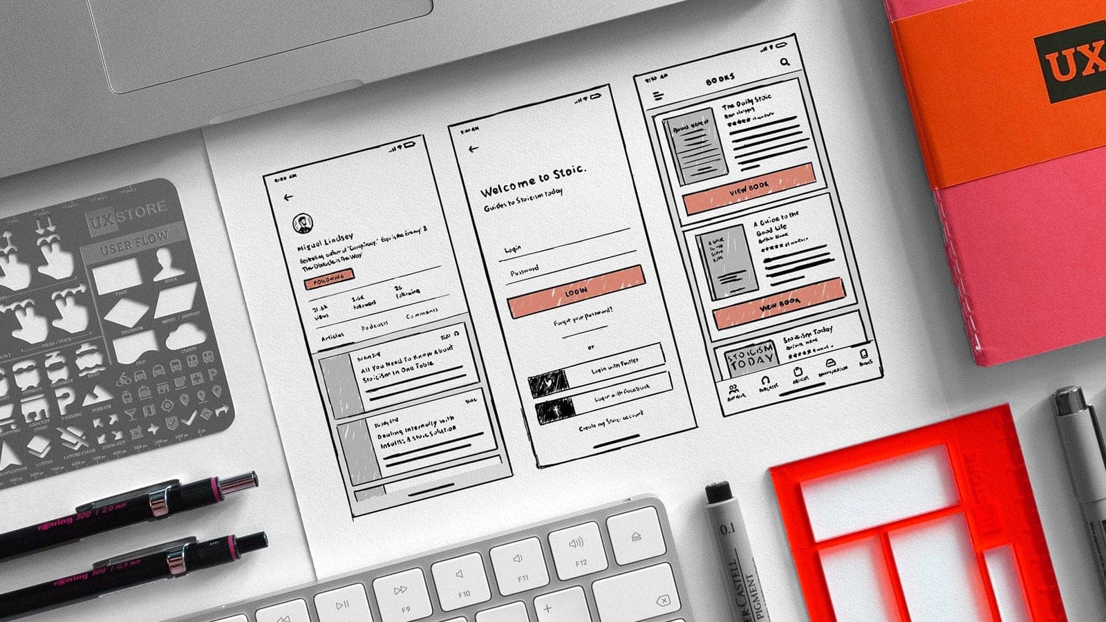
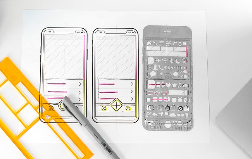
Paper Prototyping is a great low-cost way to iterate designs simply and quickly. The process typically involves sketching layouts and wireframes using device templates to create basic representations of screens for usability testing. Although primitive in appearance and not interactive, participants will begin to understand the user journeys, flows and expectations without the interactivity.
Paper prototyping is fast, flexible, and a great collaborative team process, allowing everyone to participate in the design process and focus on concepts and ideation. In a quick workshop, a team can accumulate a large number of design ideas and iterations. It can also be much easier to make decisions, give critical feedback, and erase or change parts of the design when working with sketches.
“With a paper prototype, you can user test early design ideas at an extremely low cost. Doing so lets you fix usability problems before you waste money implementing something that doesn’t work.”
Paper Benefits
- Easy to create with pen and paper
- Quick to iterate
- Low cost and affordable
- Highly collaborative
- Test user flows through simulating interactions
Making Prototypes Interactive
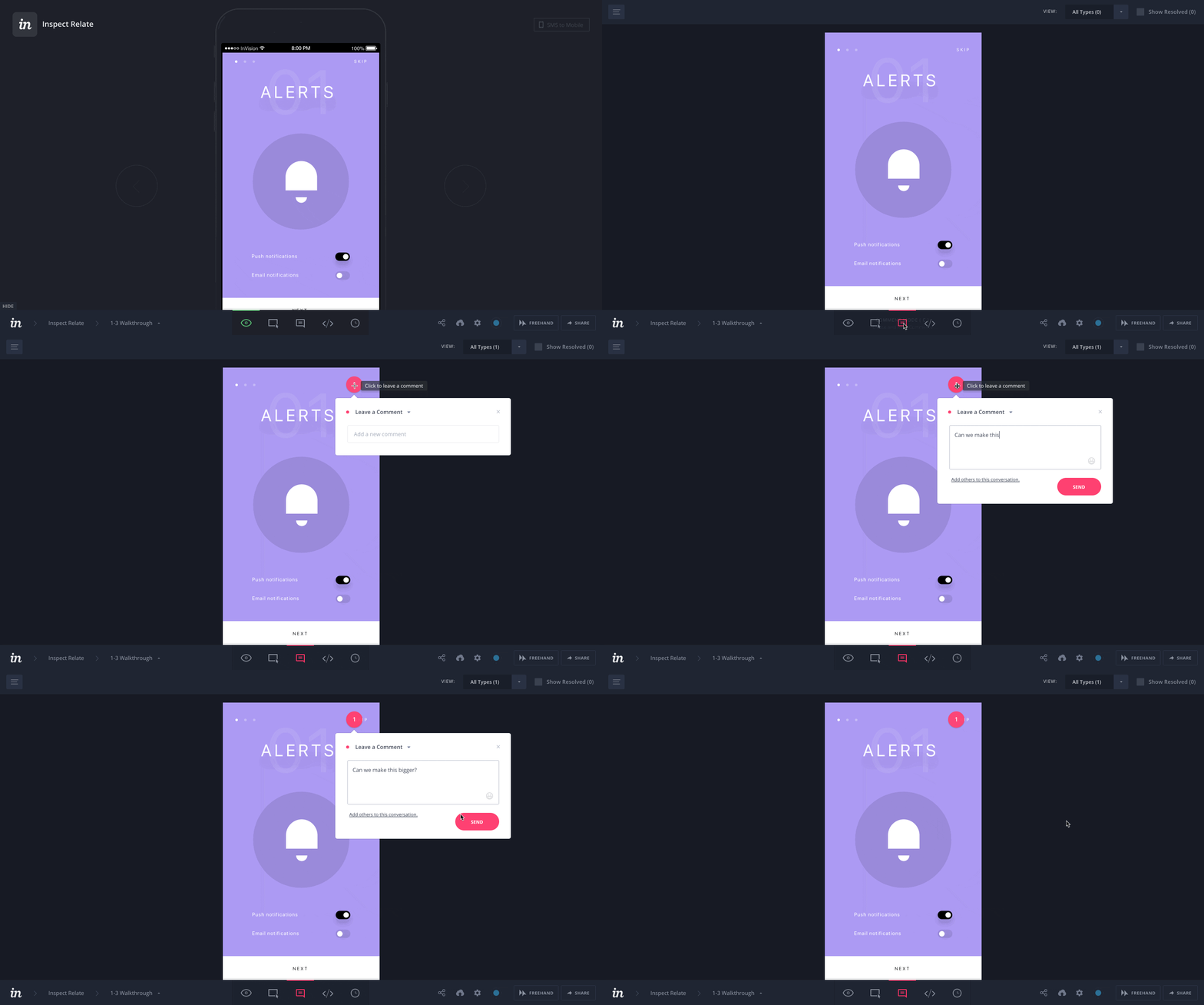
Making designs into interactive prototypes can be a quick and easy process using top industry prototyping tools such as UX Pin, Marvel, Proto.io or InVision to name a few, that allow you to simply import designs and start applying hotspots and transitions.
Here at Friday, we use InVision for its easy to use interface, rapid prototyping ability and library of predefined page transitions that allow us to create interactive prototypes for usability testings and iteration quickly. It’s also a cloud-based platform, allowing access and collaboration with the client from any machine anywhere.

Medium-Fidelity
Medium-fidelity prototypes are interactive but with basic styling and limited functionality, typically just clickable hotspots that navigate the user through static pages. This method is highly valuable for identifying user flows and pain points, understanding user patterns, expectations and validating designs through basic interactions.
When user testing with medium-fidelity prototypes we can begin to target more insightful feedback, by creating tasks and scenarios for users to complete we can focus on better understanding how users are influenced by designs and how they interact with specific features.
Medium-Fidelity Benefits
- A basic functioning version of an interface
- Validate designs through user testing
- Understand user patterns and expectations
- Allows clients to interact with the product at an early stage
- User test with a wider audience
- Target specific areas of website or app using tasks and scenarios
High-Fidelity
A high-fidelity prototype has the appearance of the finished website or app as it would look when live. With much higher levels of detail, the prototype allows testing of UI elements, information hierarchy, layouts and interactions that are not achievable in low or medium-fidelity prototypes.
High-fidelity prototypes can generally be more accurate for collecting user testing data as users are able to interact more naturally with the site or app compared to low-fidelity prototypes. This might include testing specific areas or features such as navigation, button engagement, user flows and time to complete a task.
There are however downsides to hi-fi prototypes, the time required to produce and update designs at this level can be time consuming and make quick user testing feedback fixes hard to implement. User testing with high-fidelity prototypes can also potentially make participants feel less comfortable giving critical feedback due to the high-level look of the designs.
Hi-Fidelity Benefits
- An exact representation of the final website or app
- Validate designs through user testing
- More accurate for collecting user data
- Understand user patterns and expectations
- Target specific areas of website or app using tasks and scenarios
- Can be used for presentation and pitches
Choosing the Prototype Fidelity for you
When it comes to choosing the correct prototyping fidelity for your project there isn’t a ‘blanket solution’ that suits everyone. It’s important to note that each type has its benefits and should be evaluated based on your needs.
If you are undertaking design sprints or just looking for a fast and collaborative solution, then low-fidelity would be best. If you already have designs and user feedback, medium-fidelity would be a good solution for validating your designs and identifying user flows and pain points through basic interaction. If your project has sufficient budget and a long time frame then you may look to evolve your prototype into high-fidelity for testing interactions, animations, or for presentations and pitches.
If you have a project we can help with and considering using prototyping as part of the process? Get in touch.


