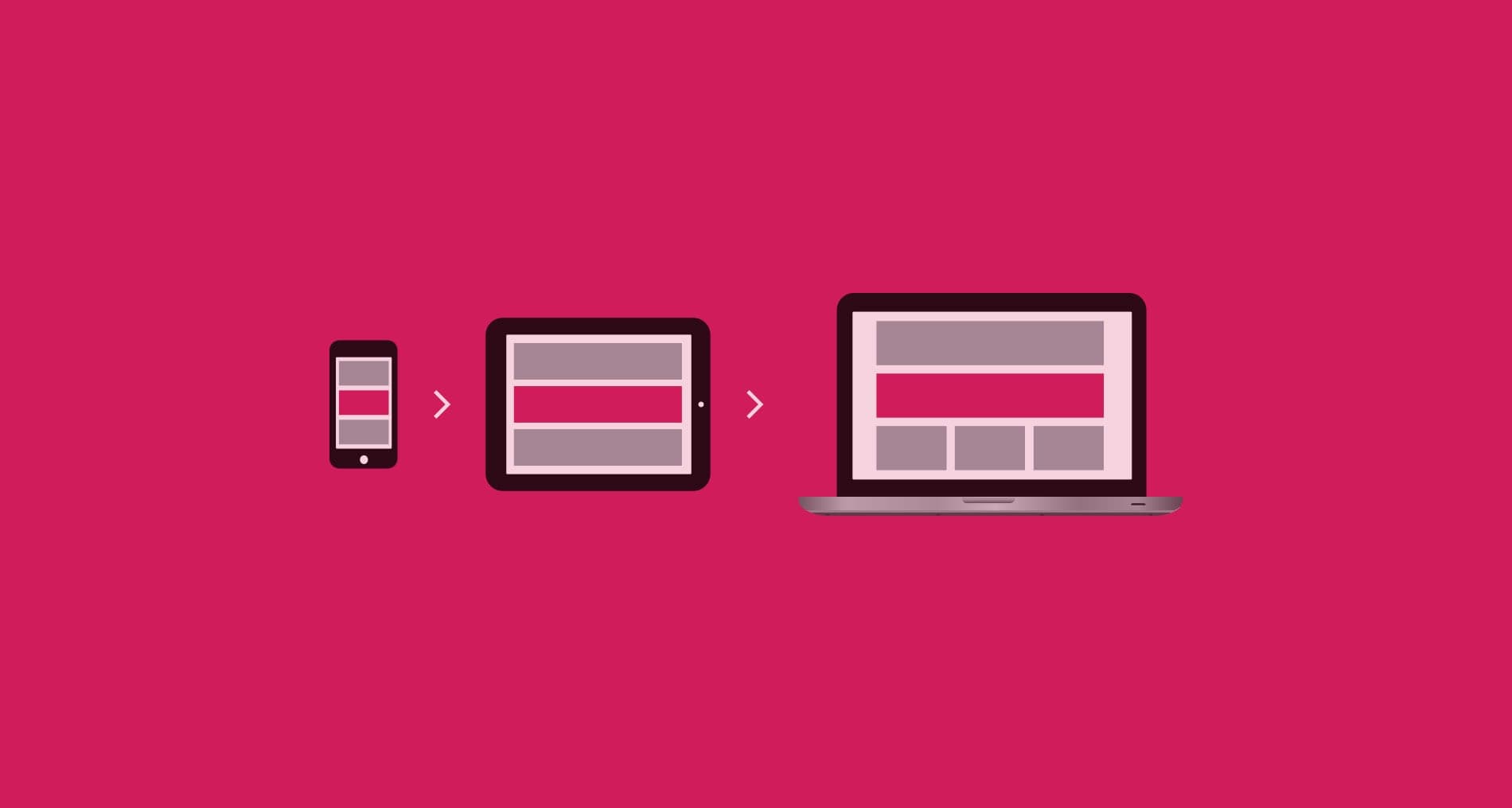
Following on from my last post User Experience for Mobile – Take care of your audience I want to bring up the concept of mobile-first thinking. Traditionally, website designers and their customers approach a new website project focusing on it’s desktop iteration, the mobile version becoming an extra goal that is completed at a later date. Now there’s an increasing trend in the marketplace to flip this process and commence with mobile concerns first, before building up to tablet & desktop models. If you still consider mobile web design a niche industry, you need to change your thinking. Mobile is no longer the future nor is it a trend. It’s right now. As the statistics prove, the web has completely broken out of it’s computer-shaped box and into our pockets & handbags.
So why use this method? Read on to find out.
RISING TO THE CHALLENGE
I switched to using Adobe Illustrator to design websites a long time ago – it’s a great tool for resizing for different screen sizes and being resolution independent, it’s perfect for creating retina graphics. It was an unnatural concept after having used Photoshop for all my designing years, but now, when I revisit old Photoshop documents in order to make changes to past client site designs, I find it frustrating and I know that I’ll never go back. So recognising that same feeling when first trying mobile-first website design was a good indication that I had room to improve and had another opportunity to master more methods. It’s clear that the approach of mobile-first is a tougher competitor but you’ve got to surrender a bit of comfort for the sake of becoming a superior designer!
THE HEADACHE
There are different ways to make design decisions but when planning a user experience for desktop, you don’t have to decide what is the most important thing when you have tonnes of space to put stuff. There are no real hard choices to be made. But when you design & build for mobile the opposite happens. You have very little room, and so the decision-making process is much much harder.
Designing for mobile means simplifying. Sounds easy but it’s not. To create a simple experience; to reveal your content & actions in a way the user will understand; to choose their position so they appear as and when they are needed and not when they aren’t, makes the job a tough one. The screen is tiny, you really have to work hard to figure out what needs to be there: primary content, secondary content, actions & other extra information. Think 2 things: user-experience and enhancement. And ONLY offer up additional information, (the frilly bits) to people when you know their devices can handle it.
PROGRESSIVE ENHANCEMENT
So instead of ‘degrading’ a website design for smaller displays, rewrite the important parts of the layout. Then progressively enhance it for serving a rich experience to more capable devices. Consider your vital content. Cut back the content material to it’s most essential components for your mobile experience. It’s a worthwhile exercise: you can display this information in an even stronger way as you deliver it to the desktop design.
To be honest, mobile-first design is not fun and it’s not easy. You are hit with constraints from the word go. But it’s the way I prefer to work, and crafting a successful web experience that is mindful of user context and device features the best way that I can (no matter how challenging) is really very satisfying.


