Smart examples of Mobile eCommerce user experience
At the best of times, selling can be challenging. Selling online particularly so.
You have to get everything right: your marketing, your product, your pricing, information and fulfilment. If you are selling products and services selling on a website, you need a good user experience and more and more, a good mobile experience.
We’re working on some exciting eCommerce projects in the Friday studio right now and putting our experience of buying online and designing great user experiences to good use.
Here is a compilation eCommerce operations who employ some nifty features and functions that give their customers a seamless experience buying online. Mobile phones at the ready please.
Helbak.com
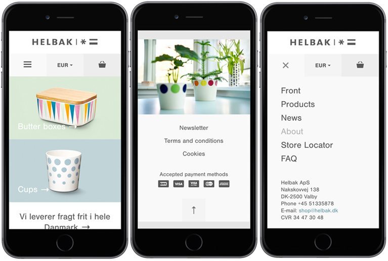
Let’s start with a Danish company who sell simple everyday-use ceramics. I like this site because of it’s overall minimal design and classic use of typography. It translates smoothly from desktop down to mobile.
No frills here, just a clean and stylish layout with beautiful photographs and a timeless design. It’s user experience is it’s simplicity. www.helbak.com
Firebox.com
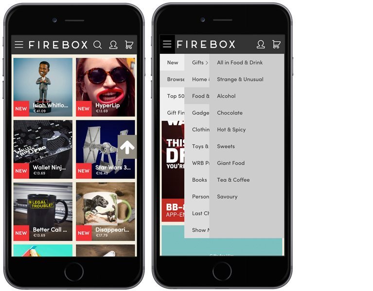
Hundreds of goodies & gadgets. While away your bus journey to and from work, routing through Firebox’s impressive range of gift items.
The best feature about this site is the subtly organised and clever layer design of the burger menu which ensures you’ll never get lost browsing their very appealing product offerings. www.firebox.com
Farmdrop.co.uk
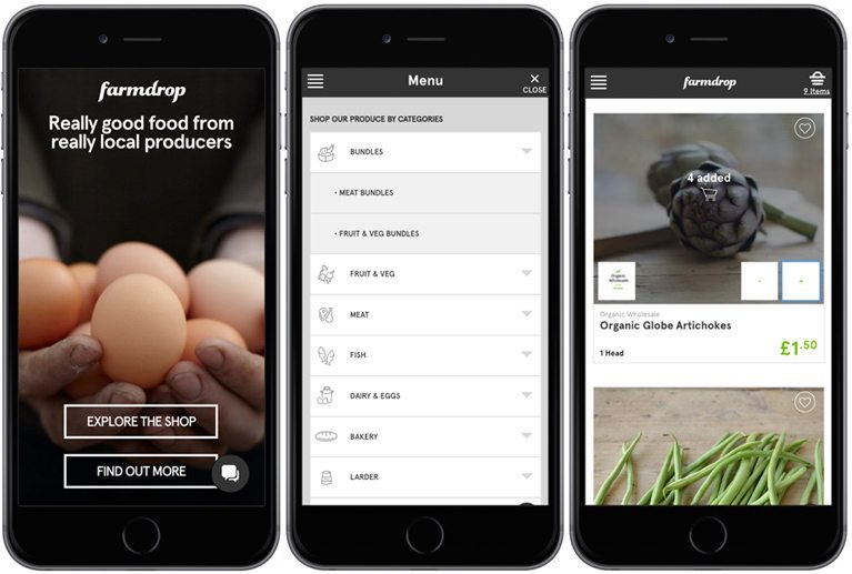
Sticking with burger menus – Farmdrop, as well as selling lots of locally fresh organic veg & food items, win our hearts with the icons they use to represent food categories in their menu.
These add to your mobile user experience visually and big buttons allow for no-nonsense link selection. Their add to cart feature is nice too and throws up + | – buttons so you can easily edit your quantities. Shame they only deliver to London. www.farmdrop.co.uk
Canopy.co
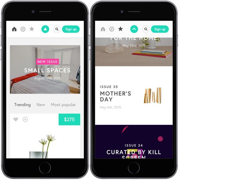
Everyone loves Amazon, right? But their product database is so big. Get help from Canopy, a community of guys & girls who pick the best of the bunch and group them into ‘hand-curated issues’ you can browse through & be inspired by.
A nice feature is their BACK TO TOP button. Scroll down and notice the logo at the top changes to an up arrow which is always present on the sticky menu. TOP buttons are known to get in the way & cover up content on mobile so this a clever solution. www.canopy.co
Evolutionfresh.com
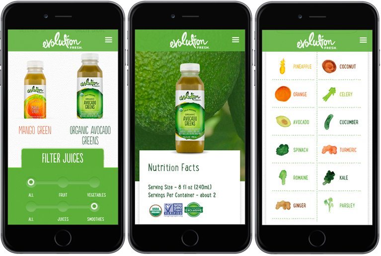
For those into nutrition, or just healthy food porn, check out Evolution Fresh – producers of wholesome juices and yogurt. They have put much effort into the aesthetics of their ecommerce site, with stylish photography and colourful watercolour icons to list the ingredients.
Their filter system is great, which is attached to the bottom of the screen. It really helps you find what you’re looking for. www.evolutionfresh.com
Indochino.com
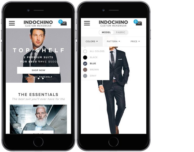
Staying on the topic of filters, Indochino use a filter bar that sticks to the top with the burger menu bar for quick access.
It’s a joy to use, as options include icons and colours – that assist you in your quest for the perfect suit, or other item of men’s clothing. www.indochino.com
Lush.co.uk
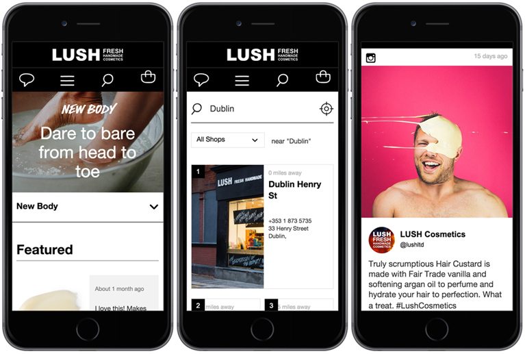
While sweet smelling air fills your nose passing by a Lush store, their ecommerce website is a feast for the eyes. A few features stand out. They take full advantage of their very active social accounts – click the chat symbol to find out WHAT’S BEING TALKED ABOUT for all the latest.
Their shop/store search facility is simple and it works. It retrieves the closest Lush shops to you with GoIP and displays their contact numbers and opening hours together in one place. A wonderful mobile eCommerce user experience all round. www.lush.co.uk
It’s a great time to be a consumer – because it’s so important to get the customer experience right, we get to benefit from improvements in design, tech and UX enhancements.


