Micro-Interactions And Their Role in UX
When it comes to User Experience (UX), most people will already know what a micro-interaction is, without knowing what a micro-interaction is. When you hover over the title of an article on a blog and the text changes colour, you know, or assume, it is a link that can be clicked. Similarly, when you hover over a button on a website and it changes colour, you know that when you click the button, something will happen. It’s these little visual cues, as well as many other subtle indicators, that make up the wonderful world of micro-interactions.
Consider the following scenario; you’re trying to log in to your favourite website, you have typed in your username and password and you’ve clicked the “Log In” button. What now? In most cases, you will see some indication that you are currently being logged in or an error warning to say you’ve entered the incorrect login details. These indicators are also examples of micro-interactions.
What are micro-interactions?
The term micro-interactions was coined by Dan Saffer, who subsequently wrote a book on them called Microinteractions, Designing with Details which is well worth a read.
Micro-interactions are the functional, interactive details of a product. These details can greatly enhance the UX when using a product or can be terribly detrimental to the users’ experience. In the example of the website login above, if there is no indication that the user has entered their details correctly or incorrectly, how will they know what action to take next and how will they know whether they can complete the task they planned to work on? Micro-interactions are not necessarily features, but they definitely matter.
Saffer defines the four main components of micro-interactions as:
- Trigger – What starts the micro-interaction. This can be the click of a mouse by the user, something that happens automatically within the system or something that is caused by an external interaction.
- The Rules – When the interaction begins, something happens and the rules define what that is.
- Feedback – This provides an indication to the user that something has happened and what the outcome of that action is.
- Loops and Modes – These define the nature of the interaction; does it repeat, what happens over time?
Where to use them?
Micro-interactions are everywhere. From logging into a website or adding a product to your online shopping cart to switching on an appliance or when your bread has finished toasting. All of these examples of human interactions with a system and feedback being provided can be considered micro-interactions.
With regard to micro-interactions specifically on websites and mobile apps, there are many instances where a well-implemented micro-interaction can greatly improve the UX. One of the more important instances is when building forms on the web.
It is imperative that the end user knows what details they are required to input and that they are given easily-digested feedback once they have entered information or submitted the form. Feedback such as email address or date format and allowable characters in a password should always be made clear to the user, and not just after they have entered their details and clicked “Submit”.
Aside from entering information into forms, another vitally important use of micro-interactions is when a user has clicked a button. In most, if not all instances, when a user has clicked a button an action will take place. When the user has clicked a button, or before that, when they have hovered over a button, they should be given some feedback to indicate if there is an action taking place or if an action has finished.
The below buttons show possible designs for some of the different states of a button. The states shown are the default, hover, active, error and success.

Some examples of both well implemented and poorly implemented micro-interactions are outlined below.
The Good
One website I particularly like when it comes to UX and their use of micro-interactions is Amazon. When making a purchase of any item on Amazon the user is given feedback at every step in the process and it’s perfectly clear what information is required from the user at the address entry and checkout stages.
Once an item has been added to the user’s cart, there is a very clear and concise message displayed to confirm the user’s action.

When adding a new shipping address placeholders are used within the form input fields to indicate to the user what information would be suitable.

If the user enters incorrect details or omits required details, a message is displayed showing what details are missing and the form fields that require the user’s attention are highlighted.

And The Bad
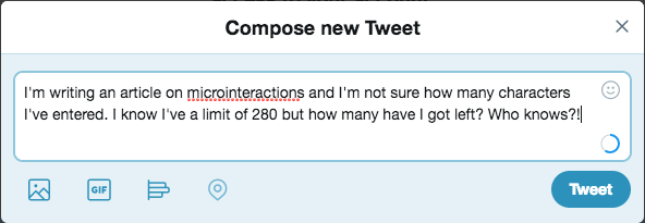
Up until November of last year, Twitter displayed a character count when a user was composing a new Tweet. The indicator was a number showing how many characters had been entered and the colour of this number would change to red when the user approached the character limit. Most users knew that a Tweet has a maximum of 140 characters so they knew when they had reached the character limit. It didn’t seem like it would make a huge difference to users if this was changed so as part of an update to their platform, which allowed users to enter 280 characters in a Tweet, they also changed the character counter to a circle that would fill with a blue line as characters were entered. Again this indicator changed colour to red when the user approached the 280 character limit.
The new circular indicator took away the instant feedback that users had become accustomed to when writing a tweet. They no longer knew how many characters they had available before reaching the character limit.

As a result of this seemingly small change, there was a huge backlash among the Twitter community which was well documented both on the Twitter platform and among online publishers, such as Mashable. This example shows that not only can a micro-interaction help to provide feedback to the user but these micro-interactions can become an element of consistency that users demand when using a website or an app.
In conclusion: Why micro-interactions are important for UX
Micro-interactions play an essential role in a user’s understanding of computer systems. They give the user feedback, both good and bad, on what the current status of the system is, what the result of their actions will be or what has already happened as a result of their action and tells them what they should do next.
This feedback can add an element of personality to a user’s experience when interacting with a website or app. They can be used to take away the dull, negligible aspect of using computer systems and make it far more enjoyable and memorable. This is their greatest contribution to User Experience.


