Intelligent UX: Graceful Degradation vs Progressive Enhancement
In this ever-changing digital world, creating websites, apps and content with a slick user experience is a constant challenge.
Yes, in our ever-changing world of smartphones, laptops and other devices, creating a beautiful user experience that works seamlessly in the latest web browsers, whilst also functioning in older ones is a constant challenge.
A lot has been discussed about this topic, but, in short, ‘Graceful Degradation‘ and ‘Progressive Enhancement‘ both target the same goal in the user experience; they just approach that goal (literally) from opposite directions.
This is a nice quick post which explains the two and they each can help deliver smarter UX:
Graceful Degradation
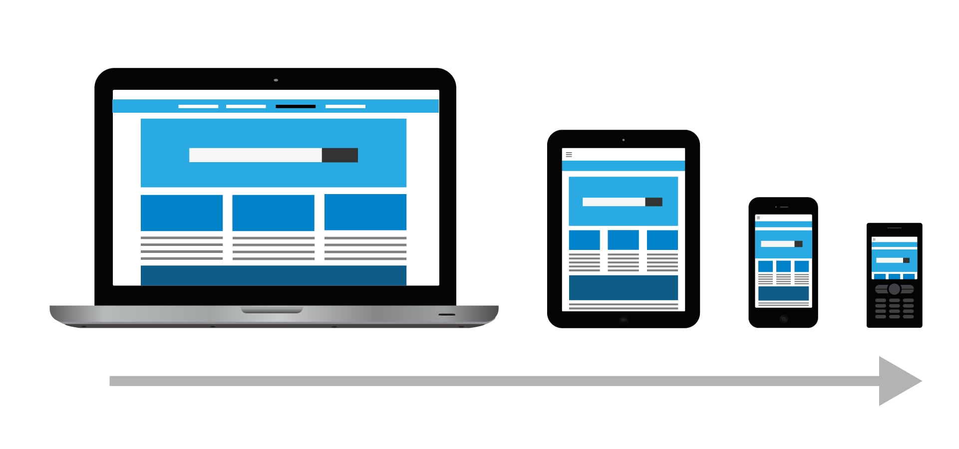
The graceful degradation approach begins with a website at its largest size, using the full functionality of modern browsers, and then removes features as the site shrinks responsively for smaller, older browsers and devices.
The aim of this process is to allow access to the basic content of the site whilst ensuring an optimal user experience on less capable devices.
Accessibility is key, ensuring all users can view your website regardless of what browser they use, the more devices and screen sizes your website works on the larger user reach it will have.
“…within the next few years, over 4 billion people will be connected to the internet via mobile and smartphone devices. Blimey.”
Progressive Enhancement
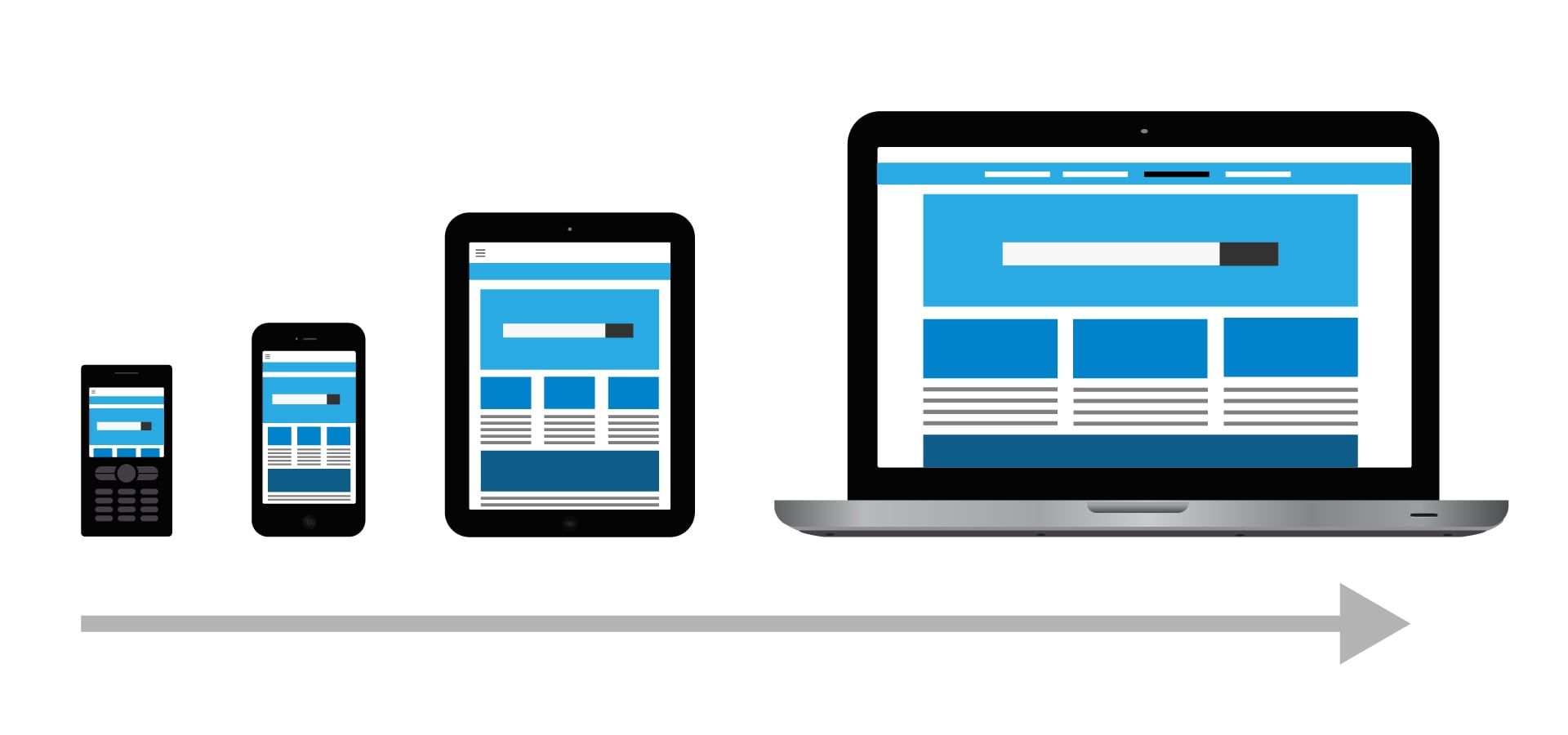
The progressive enhancement approach builds upwards, by starting with a base level of features that work on all browsers, then adding more advanced features and functionality supported by newer browsers.
Choosing One
As a designer, wireframing and designing using the progressive enhancement method allows you to highlight the most important content that needs to be accessible on all browsers and builds a clear vision of how the site should look on all size devices.
Granted, this might not be the correct method for every job since every client’s goals and needs are different.
But remember, Mobile and Tablet internet usage exceeded Desktop for the first time worldwide in October 2016, so there’s a strong case for it to be considered the more relevant method.
It’s also expected that, within the next few years, over 4 billion people will be connected to the internet via mobile and smartphone devices. Blimey.
Summary
So:
- Graceful Degradation – Designing with a baseline that takes advantage of the functionality available in modern web browsers, and then removes features as necessary, ensuring a functional solution for older browsers.
- Progressive Enhancement – Designing from a baseline of basic features supported by all web browsers, then adding more features as and when newer browsers support those features.
Jamie Geoghan is a Senior UX and Digital Designer at Friday. He’s from London and he’s a proud Millwall fan.
Catch more of Jamie’s posts here.


