How to Get a Design Job: 5 Essential Tips
We recently opened 2 new positions at The Friday Agency for both a digital designer and a web developer. Both positions have been filled and we are very excited about the 2 great new additions to our team here at the studio.
We received hundreds of applications and halfway through looking at the potential candidates I decided to share some of the common mistakes people make in their applications, hopefully, it might help some of you looking for a new adventure.
We don’t tend to use recruitment agencies when hiring so there is no triage, unchecked applications come directly into our inboxes so we see them all, the good, the bad and the ugly.
So in no particular order, here are some of the top tips I think need to be said to anyone who is applying for a job. With us or anyone else, you may find this useful, a lot of it seems obvious but you’d be surprised how many people overlook the basics when applying for a job.
Obviously, this is my humble opinion and doesn’t apply to everyone who looks at CV’s so take from it what you will.
1. Cover letters
Personally, I don’t see the value in an attached cover letter, the body of an email is a fine place to introduce yourself and give a very brief description of you, your skills, experience and why you want the job. Give me enough so I want to find out more but keep it concise, be personable and show your enthusiasm.
One candidate sent their cover letter laid out in the font Comics Sans, I wasn’t sure if they were being ironic, but it probably wasn’t worth the risk!
One of the most common mistakes is dead links on a CV or cover letter. At least 10% of the links to LinkedIn profiles on a CV or cover letter linked to linkedin.com and not the direct URL of the profile page. I had to go searching for the profile from there, others have URLs that are not hyperlinked at all.
2. Your CV
I have looked at thousands of CV’s over the years and the ones I like the best are simple and clear. Designers can really go to town making their CV’s a work of art but to be honest your design skills will be judged by the portfolio you have and not how your CV is designed. Over-designed CV’s can be too busy and hard to read. A nice clear layout on 2 pages that’s easy to read is what we are after.
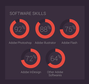
Stay away from the infographic style CVs. There is a current trend where a lot of candidates from both the design and development side add visual charts describing their skills and experience. Bar charts, graphs and pie charts illustrating experience in tools and technology, for example PhotoShop = 92%, HTML5 = 66% PHP = 78%….
This looks great but tells us very little. If your Photoshop is 92% does that mean you know 92% of all the tools and techniques in Photoshop? Maybe you spend 92% of your time in Photoshop or is it that you love Photoshop 92% of the time? How did you get to this figure? What is the 8% you are missing?
Charts like this raise more questions than give answers, they are a bit of a fad. Keep it simple, just list your skills under headings – advanced, intermediate and beginner. We’ll get into the detail in the interview.

Your life’s work summed up in pie charts
Some people think that adding hobbies and interests to your CV is pointless, I disagree, we want to know who you are, what you do in your spare time and if you will fit in with the team in our studio. Its all about personality, we want to know what type of person you are.
3. Create a design portfolio
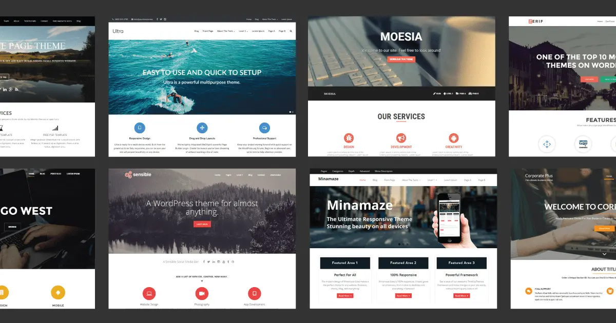
I was surprised to see many digital designers did not have a portfolio website, Behance is not enough in my view. Some sent us PDF’s of their work, others used portfolio services like Wix, we got some off the shelf pre-designed WordPress themes but very few had a custom website they created and built themselves.
If you are going to make a career out of creating a bespoke digital design you should have a bespoke website. This is what you do on a daily basis and it will tell us a lot about how you work, your design style and UX expertise not to mention illustrating your enthusiasm for what you do by the fact you went to the trouble building your own website.
I can understand people that we contacted ourselves about the position not having a portfolio ready, they are not necessarily looking for a job but those who are, have no excuse.
If you have a portfolio, test it and test it again on all devices and browsers. Ask your friends to help with this too. We received a lot of buggy websites with dead links and missing content. If you designed or built a website don’t forget to link to it, you’d be surprised how many just show small screenshots with no links.
4. Explain gap years
When looking at a CV we want to see what you have been doing over the last 6 or 7 years, keep it clear and show both start and end dates for education and positions you have held in the past.
We all like to travel and if you took a year or two out let us know, unexplained gaps in your CV make us wonder, so don’t keep us guessing. Travel, education or a year off to work on a large origami project is great and worth mentioning.
5. Communication
Communication is key if we are liaising over email or the phone be enthusiastic, be clear and show your interest. Ask questions and build rapport with whoever you are dealing with.
If you are engaging with someone get back to them in a timely fashion, don’t leave us hanging. Don’t say you are going to send your CV in and take 2 weeks to do it.
We often ask people for their salary expectation before we interview (no point in wasting your time). Be upfront about this, it’s important but be realistic and aware of industry salary standards.
If a company contacts you over LinkedIn to see if you are interested in the position, get back to them and be polite even if you are not interested in the role, you never know, you may cross paths again in the future (especially in Ireland).
So that’s it, simple and obvious to some and maybe not to others. One of the biggest things we look for is attention to detail for any position, so focus on every area of your initial contact/presentation, first impressions last and all that.
Best of luck.


