How Feature Creep can Alienate your Most Valuable Customers
If you’ve ever thought ‘I miss the old Spotify,’ or pined for the good old days of a simpler Revolut app, you’re not alone.
Apps and services that have been around for a long time have a tendency to eventually become bloated with a more complex set of features, which can end up doing more harm than good.
There’s persistent pressure for companies to innovate constantly and differentiate their services from competitors. In an effort to do so, apps and software often suffer from something called ‘Feature Creep.’
It can happen as an unintended consequence of siloed departments, a lack of focus on user needs, or the idea that the ‘everything app’ is the way to secure total market domination.
In most cases, however, it results in a poorer user experience overall due to core functionality being lost among the noise.
What is Feature Creep?
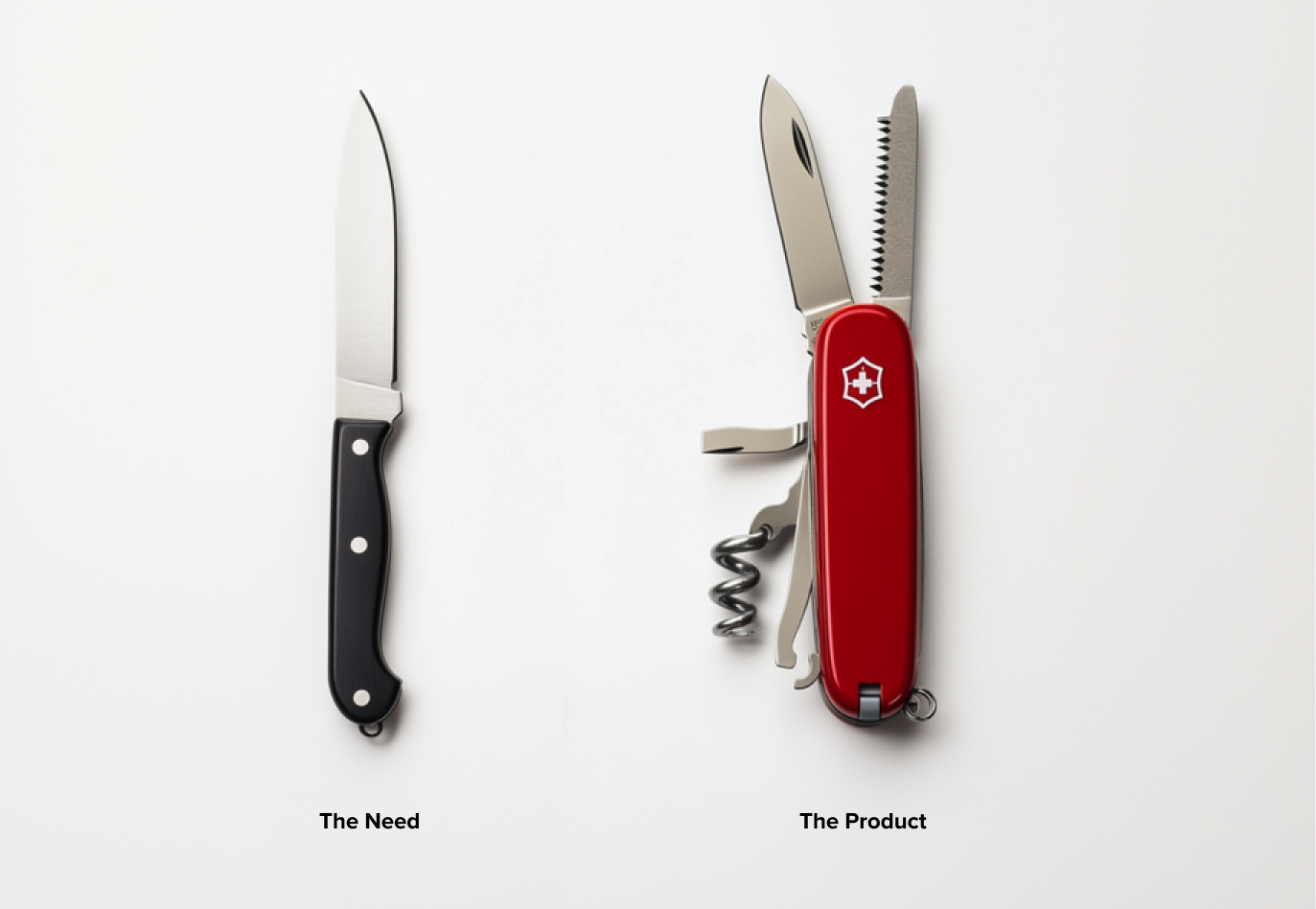
Feature creep, sometimes known as scope creep, is a gradual process where more and more functionality is added to a product.
Over time it can lead to a product’s core offering being diluted and obfuscated. Users can start to feel that the reason they started using the product is getting harder to find behind layers of complexity.
A competitor is then primed to swoop in with a simplified offering, and attract users with the functionality they wanted originally… ie what the now bloated app used to prioritise.
Whether a given app has suffered from Feature Creep probably depends on the person you’re asking.
We all use digital products in different ways, but there’s an undeniable trend of companies trying to cram in more features, more content types, and more unrelated services, and losing sight of what made them successful in the first place.
“80 percent of features in the average software product are rarely or never used,” according to Pendo’s 2019 Feature Adoption Report.
How does Feature Creep happen?
Market pressure can certainly contribute to feature creep. Companies might match new offerings they see in their competitors’ products in an attempt to keep customers from switching. They add similar functionality, regardless of whether their user base is actively looking for it.
The ever-increasing revenue goals that the investors so desperately covet are part of the problem too. The thought might go something like; “more features = more users = more profit,” but it’s not always the reality.
If you’re not in tune with your users and actively engaging in user research, you’ll be left with a guessing game of how to grow your service.
Functionality should be thoroughly researched and validated before implementation, and the cost of building weighed closely against the potential benefits.
Also, users are famously confident about what they think they want, while the reality of what they need is often much different. Implementing direct suggestions from a broad set of your users is not a good idea, and may well contribute to the creeping feature effect.

The negative effect on UX
Feature creep impacts UX in various ways, including:
- Increased Complexity: More features mean more things for users to understand and navigate.
- Reduced Performance: Extra features can slow down the software, leading to frustration, especially for mobile users or those with lower-end devices.
- Reduced Usability: Key functionalities can become harder to access, hidden behind menus or buried under layers of additional options.
Let’s delve into how these effects manifest in some popular apps.
Spotify
I still remember the early days of streaming services starting to emerge. The concept was intriguing and exciting, and the idea that artists could be so unfairly compensated for their work had not yet entered mainstream awareness.
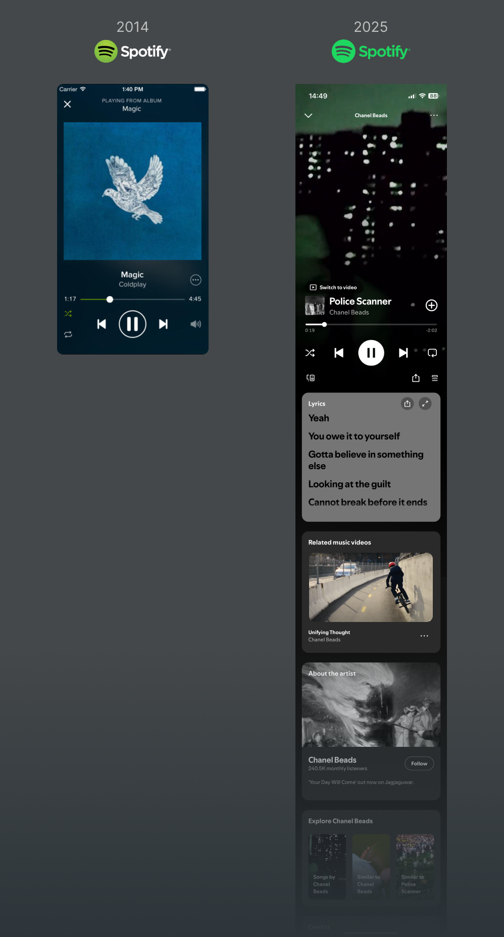
The early Spotify product offering started fairly minimal by modern standards. You could stream music for free with intermittent ads, or ad-free with a subscription.
There were other features that let you see what your friends were listening to, create playlists and so on, but it was all centred around music.
In contrast, today’s Spotify experience has branched out quite significantly. Podcasts were introduced, which seems reasonable. Personalised and curated playlists enhanced music discovery and were a welcome addition.

The step too far is debatable, but audiobooks, live events, merch stores, and a TikTok-esque vertical scrolling feature feel like the core music service is being buried deeper and deeper. Algorithmically generated playlists are pushed to the surface, and true music discovery is more of an engaged task that feels like Spotify doesn’t want you to engage in.
I just want to listen to music, man. I do appreciate reading lyrics as I listen, but I don’t want to be sold artist merch right underneath (which I assume Spotify pinches a commission from the artist via these sales), or have the AI DJ put together a soulless, mediocre mix served with an unnerving imitation of a radio presentation.
All in all, the latest Spotify experience, alongside the exploitation of artists’ work for ever-increasing profit (and other shady practices), it feels as though the essence of music enjoyment is slowly being sucked out of the product, and injected with revenue increasing ‘engagement.’
Revolut
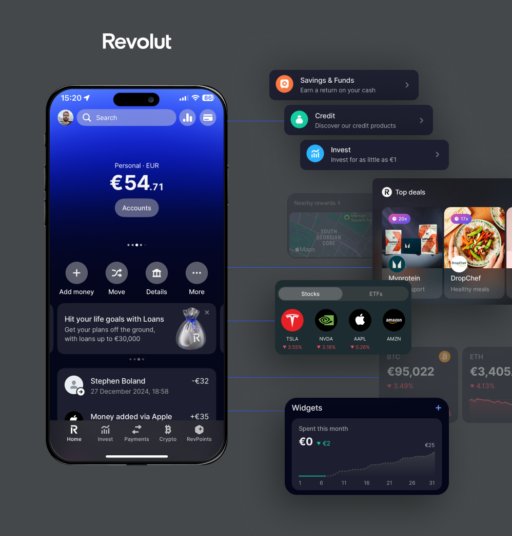
Opening the Revolut app these days feels like a covert operation to get in and out as quick as humanly possible. I know what I want to do and to be fair, I can usually do it without much difficulty.
It’s certainly not the worst offender for obscuring its core offering, but the amount of functionality that has popped up within the app that adds to the overall overwhelm is significant.
Widgets, loans, offers and rewards greet me on the homepage. Investments and crypto are also key items down in the bottom navigation, but all I’m really looking for most of the time is a list of my contacts so I can split a bill after dinner.

My core need for Revolut hasn’t changed over the many years I’ve been a customer. I send money to my friends, and I’ll convert some cash into other currencies if I’m away for a few days.
That functionality has seemingly become less important to Revolut over time (which is understandable). Innovation often comes at a price for the user who wants a simple experience without being constantly upsold.
I’m on the side of users who still have their primary bank account elsewhere in traditional banking, so I may change my mind down the line. Their customer base in Ireland is now over 3 million, so they are certainly here to stay. Hopefully, their offering won’t continue to balloon in the future, as they are clearly doing something right already.
Figma
The cloud-based design tool Figma was the first to prioritise collaboration and quickly established itself as a major player in the UX space. It was simple to use and learn and offered the ability to quickly create and iterate alongside your team members, without the need for tedious file sharing.
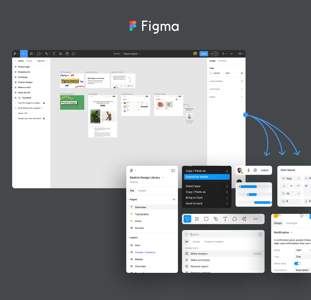
It’s the current UX tool in vogue, but I can’t imagine how daunting the interface now seems to new users. As a heavy user over the last number of years, I’ve seen it expand and indeed become more useful in many ways, but with constant functionality and layout updates it’s getting harder and harder to keep up.

Constant new releases and UI changes have you relearning how to do things you’ve developed instinctive habits around. A recent project had me using Figma a lot less, and on returning to it afterwards, the interface updates made me hesitate over the most basic of edits.
Figma’s ambition is big. Power users can certainly reap the benefits of things like token libraries and advanced prototyping functionality, but it’s running the risk of overcomplicating things for the average user.
How to Avoid Feature Creep
Don’t get me wrong, it’s not an easy task to manage innovation while also focusing on your core offering. Without some sort of growth, you run the risk of falling behind competitors, so the line between feature overload and broadening your user base is a fine one to tow.
- Fine-tune the basics. Don’t neglect what people are already using, your core offering can always be improved through user-centred design and testing, and you’ll also find out what your users need that you don’t already offer.
- Incremental changes. Once you know what might be a valuable addition to your product, roll out new features gradually and test the reception with users. This is key for maintaining customer satisfaction during the process.
- Offer customisation. Allow users to hide or disable features they don’t need, helping them tailor the experience to their preferences.
More features can mean more value, but expansion needs to be properly validated and thoughtfully rolled out. Otherwise, you’ll end up with the valuable parts of your product buried in lots of clutter and frustration.
Ultimately, by focusing on core functionality and adding only what truly enhances the user experience, companies can avoid the trap of feature creep and maintain a loyal user base.
If you’re interested in preventative or post-creep advice, get in touch with us.


