It’s 2016 — how users behave
I want to cover a topic that Ash already touched off last year, the reason I’m writing a similar post it is because I still see designers taking the wrong approach to design. We are now 2 years past the tipping point where mobile web browsing overtook desktop PC’s as the most common way users access websites. In 2015 mobile usage has soared above 2 billion users, that’s over a quarter of the world’s population. By now, every website should be mobile friendly (or Google will penalise you in its search rankings), this is a given but in a lot of cases, the process used to design a responsive website is the same as it was 5 or 6 years ago.
The old ways die hard, creating a mobile-friendly responsive website has long been part of the web design and development process but how designers approach designing for the best possible user experience hasn’t changed much. A designer might start designing a website for desktop browsers first, even though it is not the most common way most users will access the website — it’s just how they have always done it.
Some designers use a website design process called (*buzzword warning!!) ‘Graceful Degradation’. Using this approach they start by designing a website for the largest possible screen size that will contain all content, images, features and functionality for the best possible user experience in a desktop browser. They then start shifting and removing page elements as they work through designing for smaller screens and slower bandwidth, only being careful to keep the website functional. It’s almost inevitable that the mobile website will be a watered down, compromised user experience when placed beside the desktop website.
New year, new ways
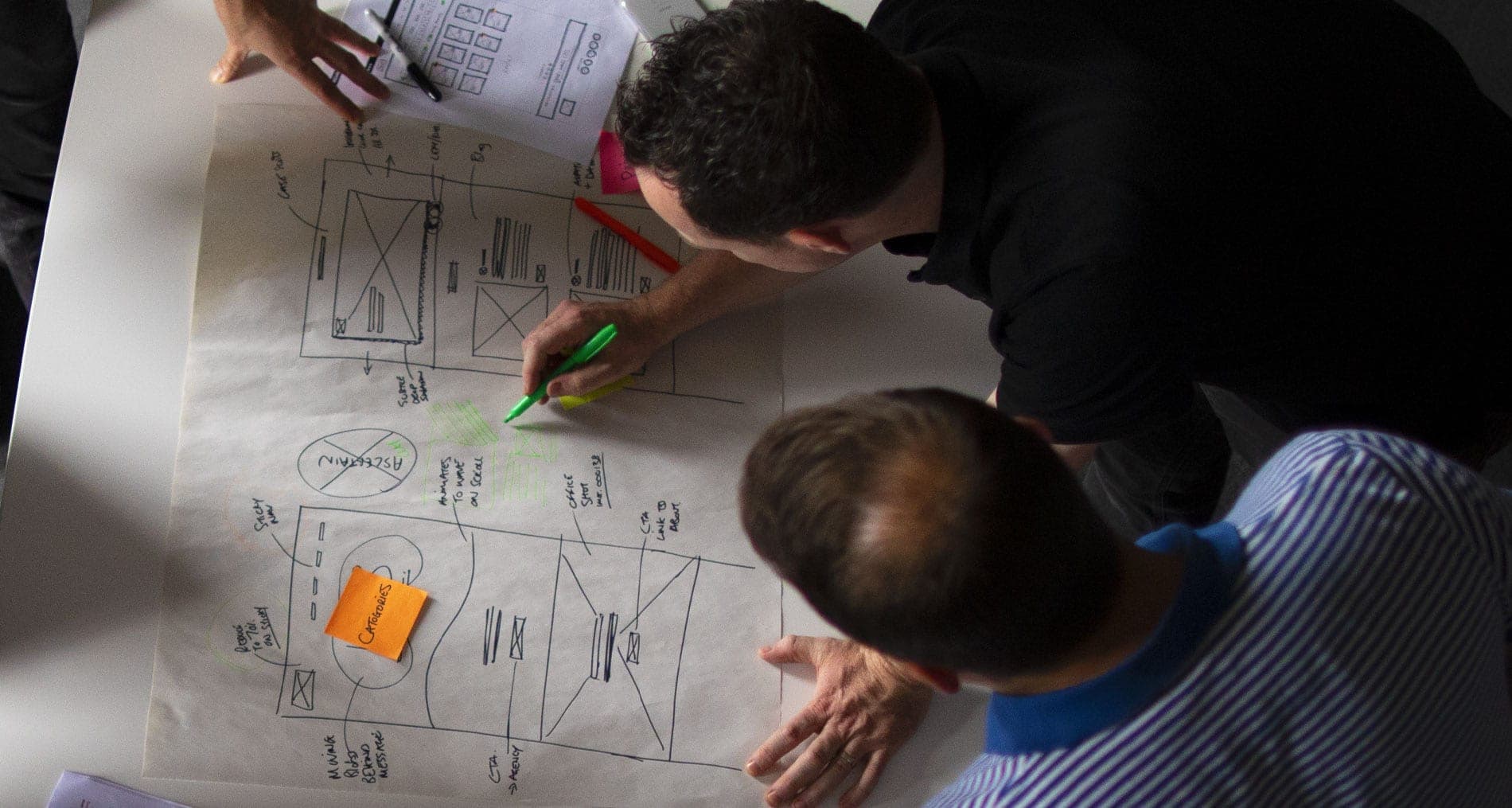
It’s a new year and a good reason to put learnings from life experience into practice. Mobile first design is in my view the only way to create the most responsive websites. I have a new buzzword for you, ‘Progressive enhancement’. Progressive enhancement is where you put your best foot forward on the mobile platforms, providing users with an amazing experience that both looks great and functions perfectly on their device, serving lean and concise content with the features and functionality they need.
The next step is to bring this design to the desktop, unlike graceful degradation where the designer decides on what to cut out to water down the product they can instead work on making it even more robust.
We’ve all heard the expression ‘content is king’, well this is very much the case when it comes to mobile UX design, the content will inform the layout, functionality and site style. Mobile first often lends itself to a linear layout, designing mobile first will force a designer to make important decisions about the content hierarchy and what is to be displayed or hidden. The most important content is usually on the top of the screen, followed by the next and so on. This is unlike a desktop approach where you can put two blocks of content side by side for equal impact.
Often we see websites full of waffle, too much text to crawl through, people don’t read websites, they scan them for relevant information. Who wants to read a 400 word mission statement on your homepage? The mobile first approach will help us keep content in check simply because there simply isn’t enough room for waffle, this can only have a positive effect on the user experience across all devices.
The mobile-first principle can also apply to how your site is built from a technical point of view. Using the old ways we would have loaded all the content from the full desktop page and hidden what we are not showing on mobile, this results is a unnecessarily long load time. Using a mobile-first development approach we load only what we need on the mobile platforms with the rest loading on an as-needed basis. This leads to faster load times and a better user experience.
Progressive Enhancement is not religion, it works in a lot of cases of UX web design but there are always exceptions and we look at every project individually before deciding on an approach. For example a recent project we worked on was designing a new responsive MS SharePoint intranet for AIB, a resource that would always be accessed primarily on desktop PC’s by over 15,000 users on a daily basis so obviously we used a desktop first approach.
The challenge
The aim of mobile first responsive web design is not to reverse the underlying problem, creating a poor desktop experience instead of a poor mobile experience. Both mobile and desktop solutions will benefit, your users will be happy and sales, engagement and goal conversions will follow.
Designing for mobile first is far from a natural transition, it’s not comfortable. Designing on mobile is restrictive in terms of space but its a challenge that needs discipline, especially when it comes to content, it’s not easy but it does give you a better result in the end. If you are not convinced, give it a go and let us know what you think.


