Design Trends & Usability: The Hamburger Menu On Desktop
Should you use a hamburger menu on desktop screens? Is it clean design or bad UX? Let’s find out.
Welcome to the first in a series of posts in a showdown of design trends vs usability. The idea is to look at some common web design trends and identify whether they have a negative or positive impact on usability and by extension user experience.
First up is a navigation design trend that first appeared about five years ago and was popularised by Facebook’s mobile app. The 3 lined menu or as its more commonly known; the hamburger menu.
Now as I’m sure you are aware, it appears in pretty much every responsive website (mobile) and a significant proportion of mobile apps.
The benefits of a hamburger menu are obvious in a mobile environment where having a full navigation menu is simply unpractical. What’s intriguing is its evolution from a mobile usability best practice to a common form of desktop navigation.
This is the focus of this post. I will explore the arguments for and against using hamburger menus on a desktop website and more importantly perform my own research through user testing using UsabilityHub.
Previous Research & Commentary
Admittedly, the topic of using hamburger menus on desktop has been widely debated among designers and UX experts. Most of the arguments come down to clean, minimalist design vs usability.
Arguments for:
UsabilityGeek cite one study’s findings that when users are given too many options, they are 10 times less likely to act. Thus by having a strong CTA within the hamburger menu it helps to point users down the conversion path:
By keeping the navigation simple, eliminating extraneous options and providing a clear objective, you are pointing your users in the right direction toward making a conversion.
Hamburger menus also fit in well with clean, minimalist design. When paired with strong visual elements and a clear call to action it can help users perform desired actions.
Also, by having the main navigation hidden behind a hamburger menu it allows designers to be more creative with white space, large images and direction.
I wrote a previous article on designing for conversions where I mention some key design principles such as direction and whitespace that when used effectively can increase conversions. Using a hamburger menu allows you to utilise the principles more effectively.
Arguments Against:
The majority of research and commentary against hamburger menus focuses on user experience. The hamburger menu inherently adds an extra step for for a user to navigate to a given page. Any UX professional will tell you that adding unnecessary steps to a user journey is a huge no no.
The Nielsen Norman Group, widely respected as leading industry experts on UX & usability have done extensive research on navigation trends. Some of their findings include:
For desktop sites, demoting your main content categories into a drop-down menu makes it harder for users to discover your offerings. Source.
Discoverability is cut almost in half by hiding a website’s main navigation. Also, task time is longer and perceived task difficulty increases. Source.
On a large screen, hiding the chrome significantly affects discoverability and interaction cost, with virtually no improvement to the content-to-chrome ratio. Source.
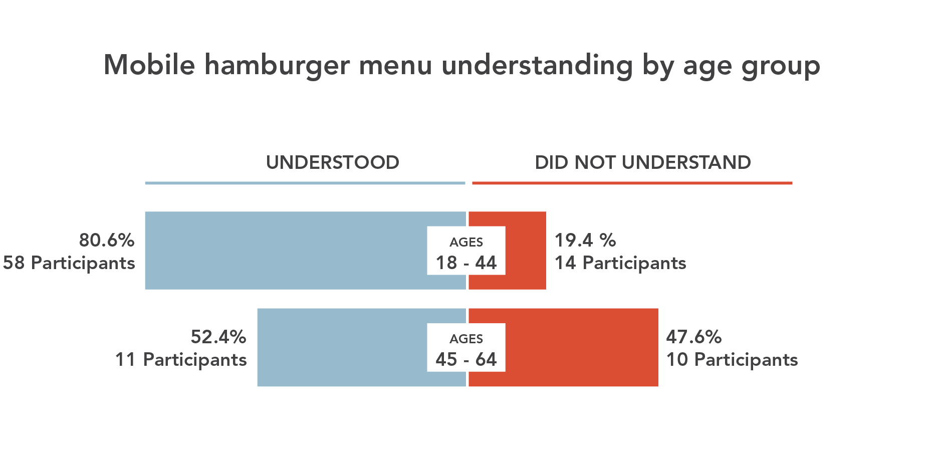
Another point to consider, particularly if your website audience is predominately over 45, is that only 52% actually understand what a mobile hamburger menu is according the Catalyst Group. And this is for mobile!
Hypotheses & Test Design
A lot of the articles and blog posts I read when researching the topic had strong opinions both for and against hamburger menus but very few had evidence to back up their claims. So I felt it necessary to gather some data from user testing to back up any points I make.
To conduct this research I decided to use some of UsabilityHub’s services. They provide a suite of usability tests that you can use to test pretty much any element of web design.
Their user pool also provide very detailed feedback on the tasks they’re set. Very useful if you don’t want to annoy people on your mailing lists.
For the purposes of this post, I focused on 2 types of test; Navigation Tests and Preferences Tests.
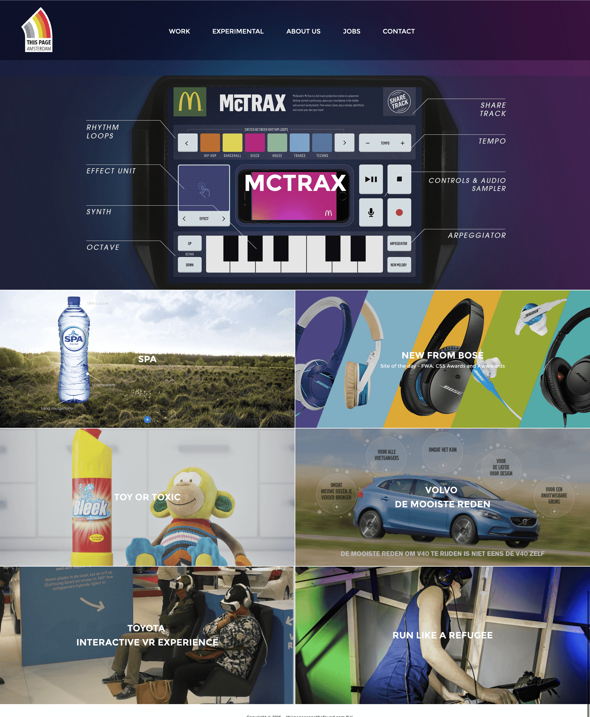
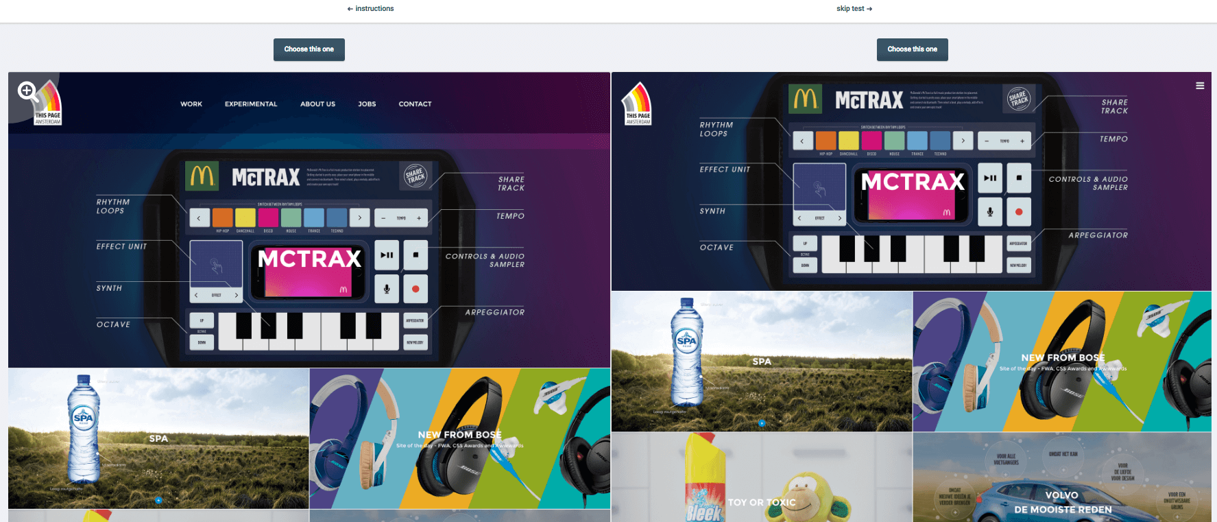
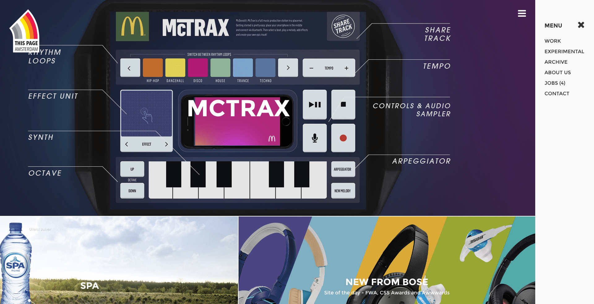
The site I used for the testing was thispage.amsterdam which uses a hamburger menu. I edited the site to create a version with a top navigation, keeping to the colour scheme of the site and using the same font (and font size).
Navigation Tests
Navigation tests are used to identify how effectively users navigate around your website. As the hamburger menu is ubiquitous among mobile design I don’t expect users to have difficulty finding the menu. However, it is still important to test this for the sake of being thorough.
Before users start the test they are given a set of instructions and are required to confirm that they understand the task. For both navigation tests I asked users to find the contact page of the site. A high res screenshot of each site was uploaded to UsabilityHub’s interface where all click locations are recorded.

Test #1 – With Hamburger Menu:
Step 1:
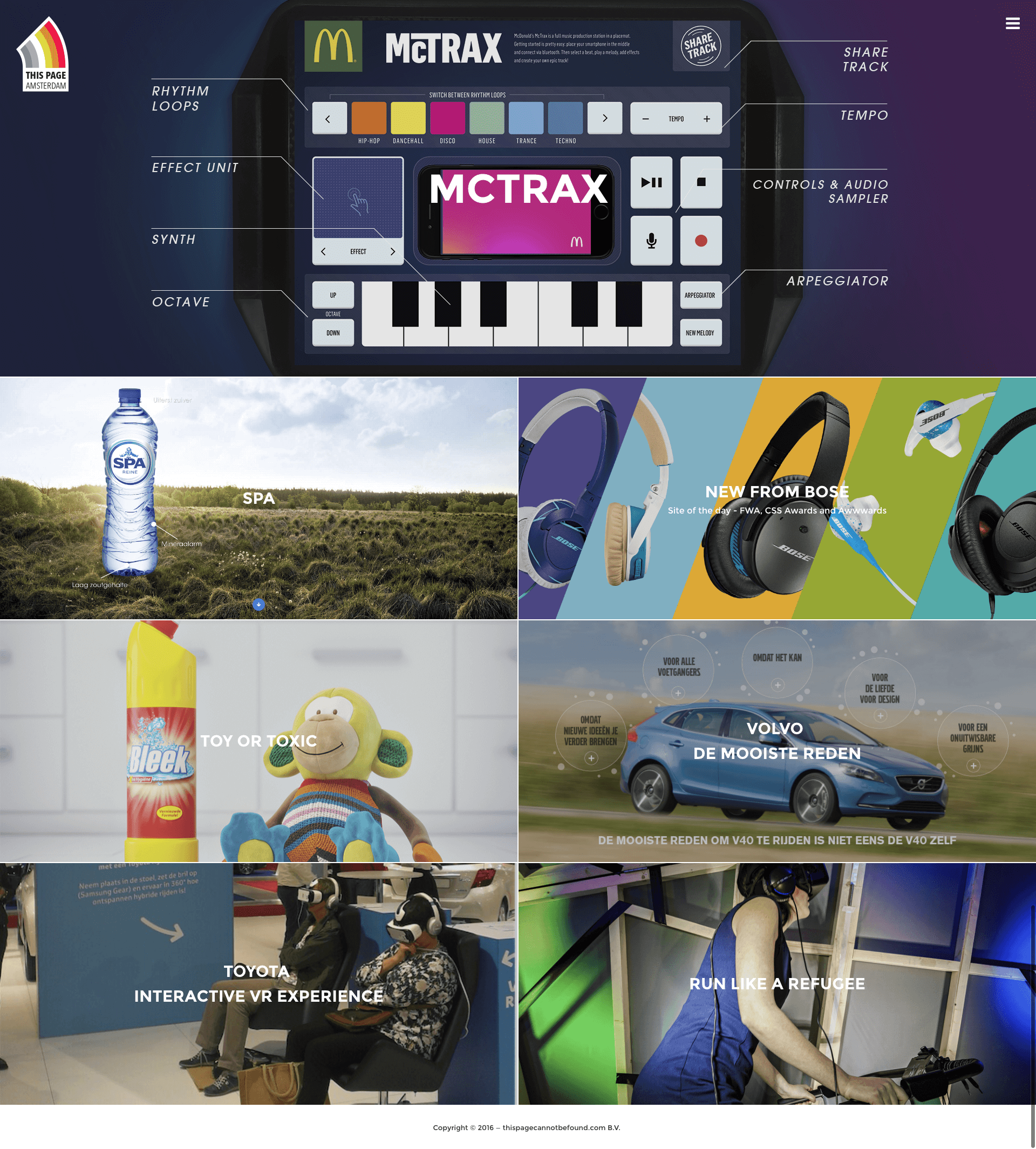
Step 2:
Test #2 – With Top Nav Menu (1 Step):
Preference Test
Preferences tests are quite self-explanatory. Users are asked to pick between 2 options based on a question. Essentially its an A/B test.
This is the important test. It puts the two variants of menus beside each other and asks users to decide what menu they prefer and why.
Based on the previous research I have discussed I would expect the top menu navigation to be more preferable.
Instructions:
Test #3:
Results & Conclusion
A total of 171 unique participants took part in the tests, check out the results below:
Navigation Tests
Test #1 Results – With Hamburger Menu:
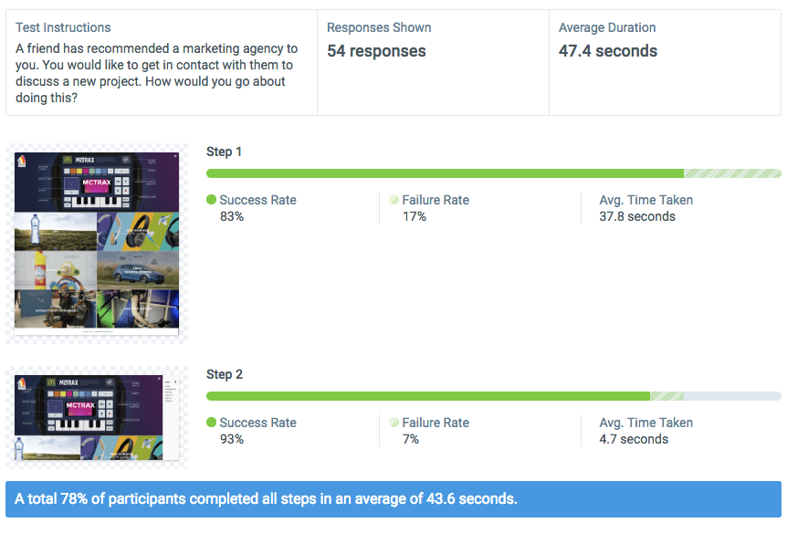
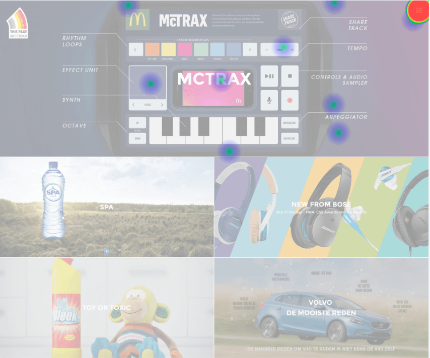
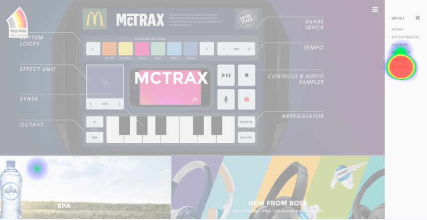
As expected the majority of users (83%) had no problem locating the hamburger menu. A couple of users got a bit confused and clicked the “MCTRAX” featured image thinking it was some sort of menu.
The interesting result here is how long users took to complete the task. The average (successful) test duration was 43.6 seconds* which is higher than I would have expected. However, once users found the hamburger menu it only took them 4.7 seconds to find the contact page.
*Please note this time includes the time taken to read the instructions, which was 14 seconds on average.
(View the full results here)
Test #2 Results – With Top Nav Menu (1 Step):
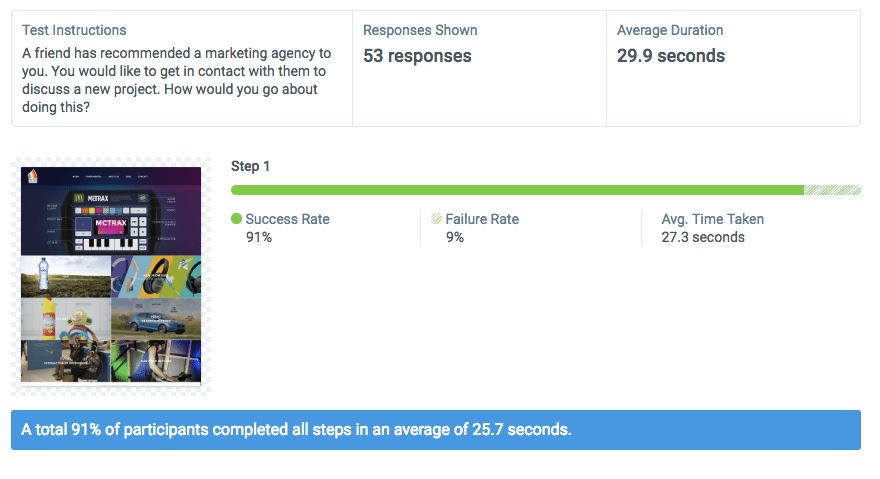
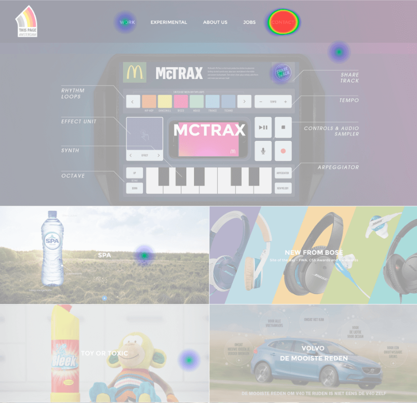
The top navigation menu had a higher success rate of 91% but the key point here is the test duration. Users took an average of 25.7 seconds* to find the contact page link in the top menu.
This means that users completed the task 42% quicker than the hamburger menu test. This is particularly alarming if you consider how impatient internet users are. 40% of people will abandon a page if it takes more than 3 seconds to load.
I know that stat is not directly linked to navigation but it highlights that time is of the essence!
(View the full results here)
Preference Test Results
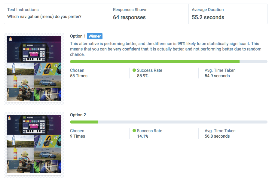
As you can see from the above we clearly have a winner. 85.9% of testers preferred the top menu navigation. Users took nearly a minute to make their decision which shows they thought about it carefully.
What’s interesting is the reason people gave for their choice. The below word cloud illustrates why the top nav performed better:
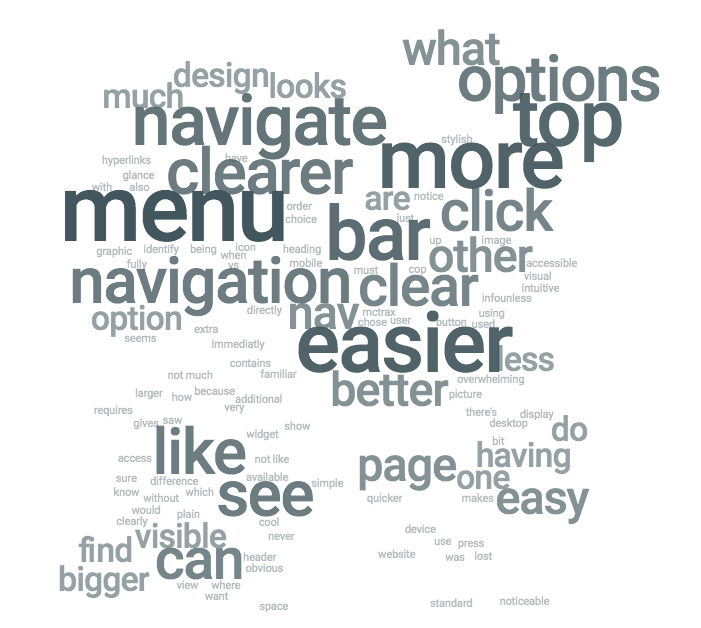
Here are some of the full responses.
Requires one less click for navigation. Also easier to know what other options are available.
More noticeable vs. the other choice which I have to click for the menu to show up
Menu is immediately accessible, more easier to navigate on the website
With the hamburger menu, as expected people noted that the design looked cleaner and more aesthetic:
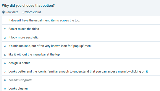
(View the full results here)
A Final Word
So what have we learned from these tests?
- Top navigation menus are easier to use than hamburger menus
- Top navigation menus are quicker to use than hamburger menus
- Users prefer top navigation menus to hamburger menus
So you should definitely never use a hamburger menu on desktop right? Not necessarily. There are a couple of things that I must recognise:
- The data set is relatively small
- The demographics were quite broad and differed for each test
- Only 1 website was used for the test
The most important thing to consider is your own website goals and your audience. So when making a decision whether to use a hamburger menu or top nav it is imperative to test on your target audience.

