The future of design as a whole is on the brink of a major shift thanks to generative AI models. As a designer myself, I’m particularly interested in text-to-image tools like Dall-E and Midjourney.
AI is likely to completely transform the process of User Interface Design for websites, apps, and the digital space in general. And soon.
Let’s take a look at some AI tools available right now, and if they’re actually of any use for UI designers.
I’ll also highlight some of the more promising-looking tools that aren’t yet publicly available, but definitely worth keeping an eye on in the near future.
But wait, what is text-to-image AI?
A brief description for the uninitiated. Text-to-image models have been around for a while now, but have been rapidly improving in quality in the last year or so.
Essentially, they use machine learning models to generate images from a simple text prompt.
They are trained on large data sets of existing images in order to understand how to turn your text prompt into an image that looks like what you’ve described.
So, all you need to do is type a description of the image you want and hit enter. Magic! The art of getting decent results lies in the quality of the tool you’re using, and the quality of your text prompt.
Just check out the thumbnail of this post for an example of an AI generate image!
So what can AI do for UI Designers right now?
The short answer is.. not a lot, yet.
Yes, the likes of Dall-E, Midjourney and Stable Diffusion can produce some astounding stuff from a purely visual design perspective. How they perform when tasked with UI-specific prompts is less impressive, for a couple of reasons:
- They can only produce flat images, so you can’t directly edit the output in a design program like Figma.
- They don’t do a great job with text, it mostly looks like a cryptic alien language.
- Results vary in quality and are probably more time-consuming than just searching on Dribbble or Awwwards.com.
- When working on a project, you’ll have some content structure in place before you get to UI. AI tools can’t really take this into account, so a generated Home page may not be applicable to wireframes you’ve developed.
These tools can produce some nice inspiration and moodboarding assets, but that’s about it right now. Check out some of the results I got from the following prompt:
“Mobile app home screen for a music festival, modern, minimal, purple colour palette, dribble, high-res”
Stable Diffusion:
Not a bad effort, but there wasn’t much of use bar the colour palette. Though the illustrations are nice, they really aren’t usable unless recreated manually in vector format.
The strange melding of the phones on the right is quite amusing, as the AI tries to interpret what a phone should look like.
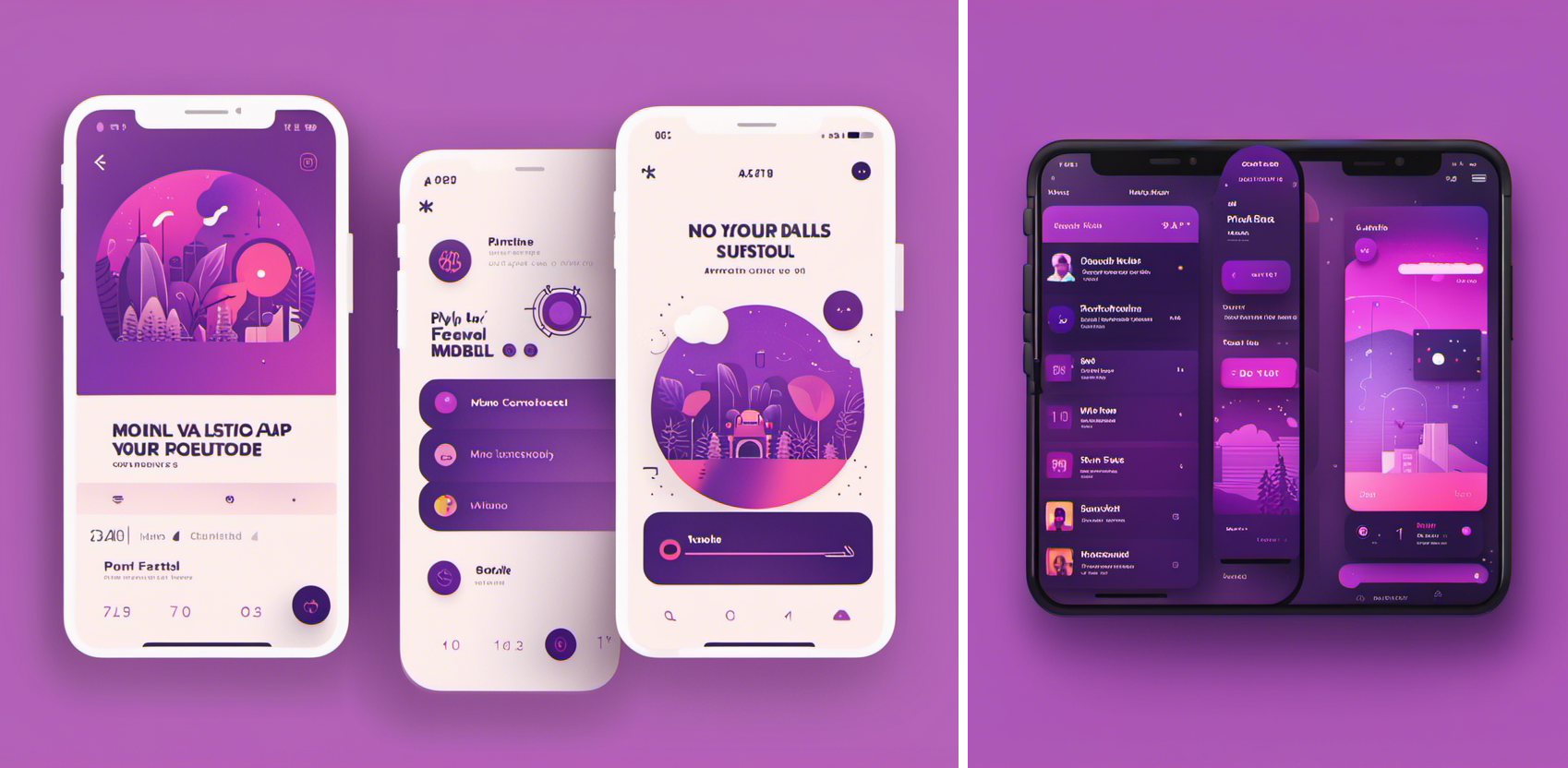
Stable Diffusion’s UI effort
Midjourney:
A little more impressive, it gives some indication of a weather tracking feature, and the details are crisper and generally better quality. It certainly has a better grasp on what a phone looks like.
Generally, it sparks the creative part of your brain as inspiration, but not much else, and I could find a plethora of similar images on Dribbble pretty quickly.
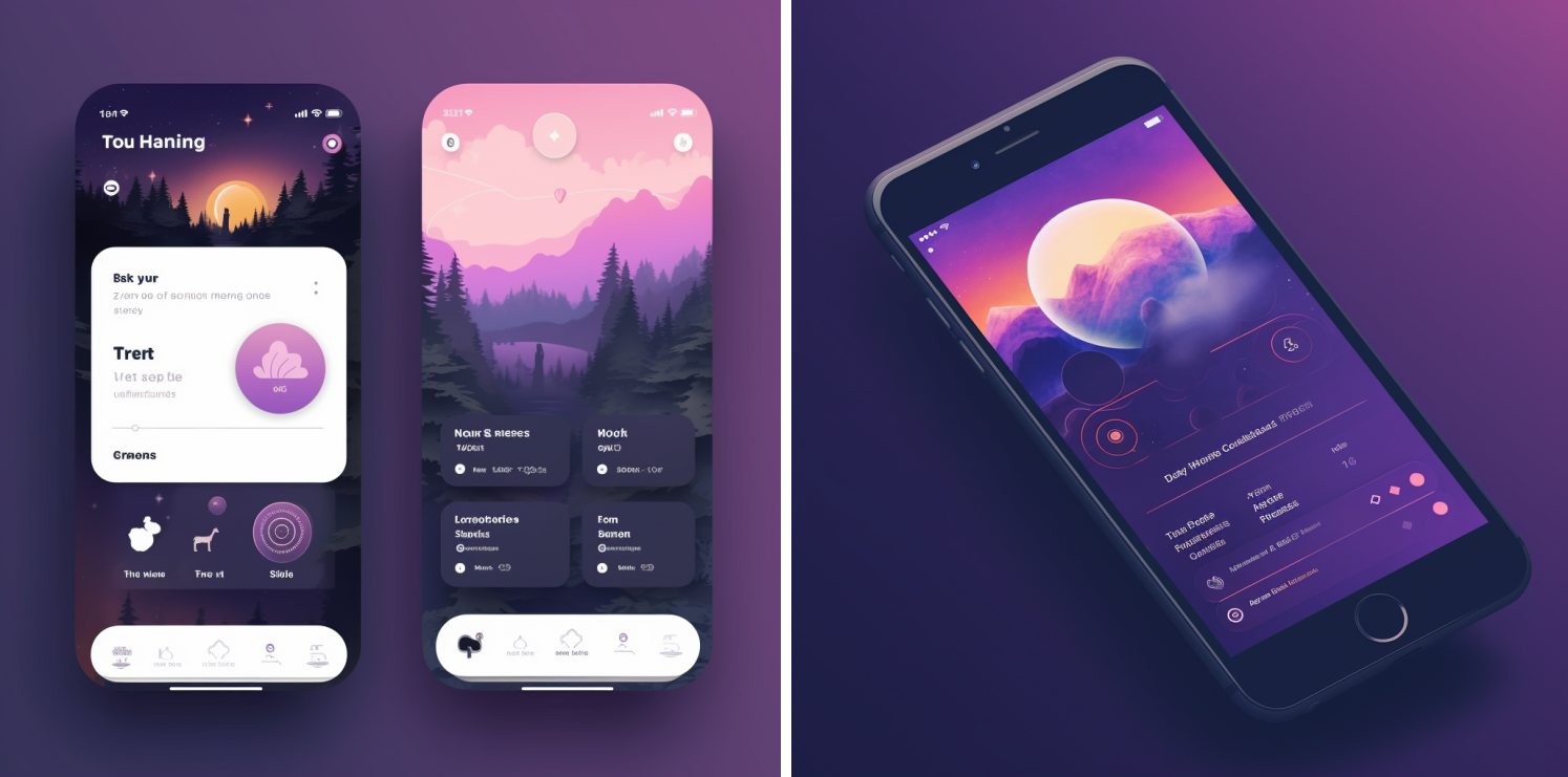
Images generated by Midjourney
Overall, results from these tools are difficult to interpret. It’s like an alien’s best guess at what an app might look like. Given that the AI is essentially doing something similar, it’s not surprising.
Magician/Dall-E
Magician is a plugin for Figma (made by Diagram, more on them in the next section). It harnesses the power of ChatGPT and Dall-E 2 to give you some nice little AI tools right in the Figma UI.
I tried out the Magic Image and Magic Icon tools to generate some logos for a pharmaceutical company. It’s not revolutionary, but definitely exciting to see how this could speed up the idea-generation process.
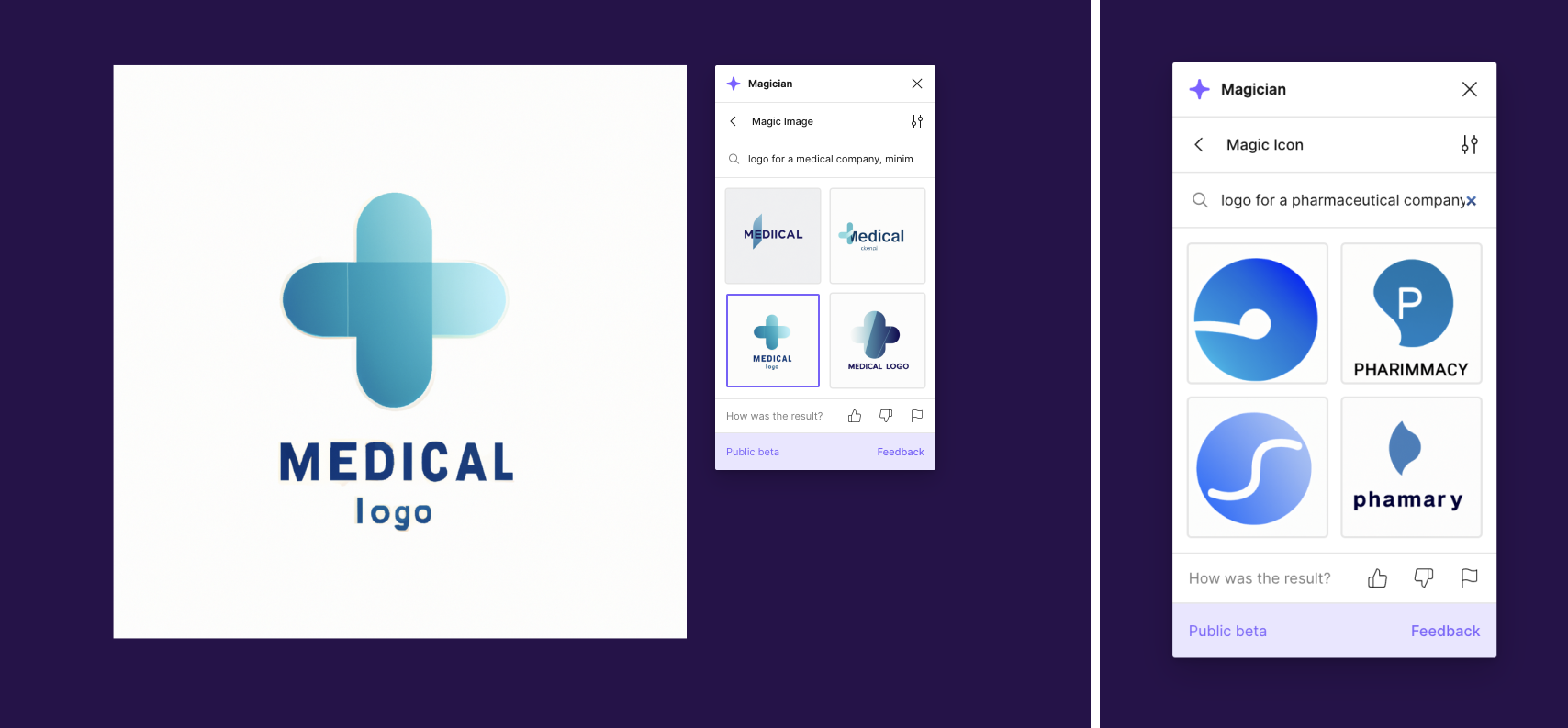
Magician uses Dall-E 2 to generate images via a Figma plugin
Side note, ChatGPT is amazing for writing short copy snippets for your prototypes, a use-case for AI that I’m already using quite a bit.
The tools to watch out for
The prospect of including AI as a core part of the UI process in the near future seems very real. Generating specific, editable vector UI layouts with a click could be a game changer, and it’s only going to get more powerful with time.
Here are some of the tools you should keep an eye on. Some are only just announced and not yet publicly available, so we can only speculate until we get hands-on.
Framer:
Available now and a lot of fun to play around with, Framer’s AI page builder takes your prompt and starts designing in front of your very eyes. All the elements are editable, and you can regenerate the typography styles and colour schemes at will.
It’s a big step up from the text-to-image tools in terms of UI, but certainly not an end-product right out of the gate. There’s still a lot of work to do for a designer to bring a mockup like this to the finish line, but could shave a good half hour off the start of a given task.
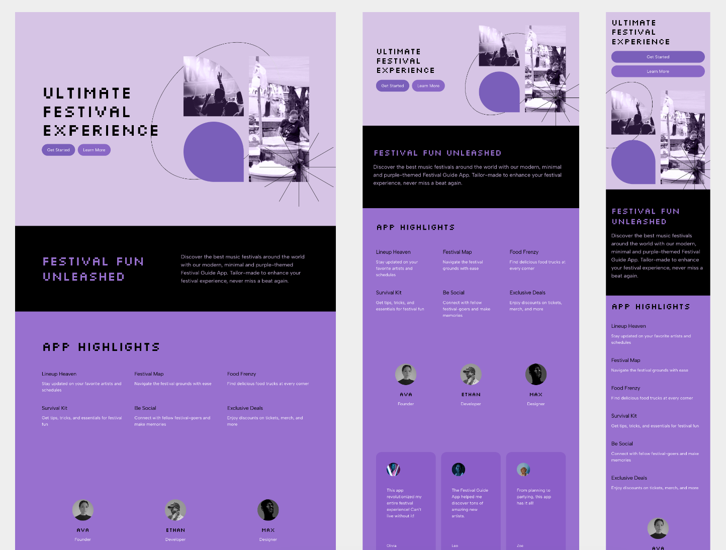
A set of AI generated UI mockups using Framer
Diagram & Figma:
Figma is already the biggest player in the UX design tool space, and they recently acquired a rather successful AI Design startup called Diagram. It seems they have a few AI tools in the works, and they look promising.
Their Genius tool claims to be able to “autocomplete your design using components from your design system.” Unlike something like Framer which just generates a unique UI each time, this could potentially work with your existing design system, and anticipate what you want to do next.
Actual details are rather scarce, but having seen Figma’s output so far and their commitment to the design community, I have high hopes for this one.
Galileo:
A slightly more mysterious player in this space is Galileo. Similar to the previous tools, it claims to turn “natural language prompts into high-fidelity designs,” as well as produce copywriting and illustrations based on text prompts.
They seem to be less forthcoming about the company and the tool itself, so we’ll have to wait and see if it can deliver. With a few competitors emerging at once, it’ll take something special to really get designers on board.
Wix & Webflow:
Also worth a mention are the no-code site-builders like Wix and Webflow. If you’re less design-savvy, you might go straight to Wix ADI to generate a site based on a description of your business.. in theory. In reality, you’ll need to do lots of fine-tuning with the site layout and content, but the idea is enticing.
Webflow is also promising some powerful AI-enhanced content and styling functionality. It’s not a tool for beginners, but with some practice, it’s one of the most versatile ways to build a site without coding skills, and AI is only going to make it more accessible.
The Future of UI Design
While this is all very exciting, it begs the question; will this replace UI designers altogether? I don’t think so, not in the short term anyway.
UI design is a lot more than making pretty pictures, and it’s never done in isolation. So you can create a nice-looking template with a click? It’s useless if it ignores user pain points, and it certainly can’t test the UI with real users.
A designer’s expertise will likely always be required to both craft an AI input, and then moderate and fine-tune the output. Generative AI will likely find a home in a UI designer’s arsenal as a time-efficient extension of their expertise.
Realistically, here’s where I’m hoping AI will fit into my workflow:
- Speeding up the process of gathering lots of visual inspiration.
- Generating a decent editable starting point for screens and specific interaction scenarios.
- Anticipating and suggesting UI components from my component library, that fits into a layout I’m already working on.
- Quickly producing realistic copywriting and placeholder imagery for mockups and user testing.
In conclusion, it’s an exciting and daunting time to be a designer.
Though the AI revolution won’t outright replace designers, it will certainly leave the un-trained in its wake, which is why I’m keeping a very close eye on the ever-developing landscape. It’s changing by the week, so you better keep up!
We try to keep our ear to the ground here at Friday. Get in touch with our UX Design team to understand what an experienced team can bring to your next project.
