Everything UX designers do should be based around making the experience for users as fast as possible.
If you were to boil down the purpose of a UX designer into one concise sentence it should be “A UI designer who works to save the end user time”. It’s as simple as that, everything designers do should be based around making the experience for users as fast as possible. If it’s not easy, intutive, simple, clean and clear its not going to be quick.
Users will complain if what they want to do online takes longer then expected and things will only take a long time if the user doesn’t understand something or cannot find what they are looking for.
I could write a book on this but to make things easy and quick for the people reading this I am just going to list 10 mistakes UX designers make that waste your time and create a bad user experience.
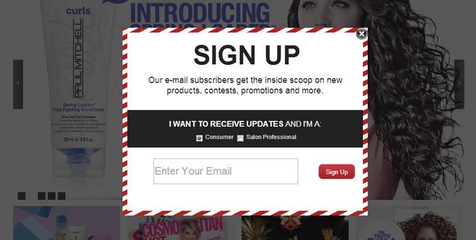
1. Newsletter popups

I’m starting with my biggest gripe, I go to a website to find out about a product and before I can blink a giant popup covers the homepage asking me to signup for the company newsletter so I don’t miss out on anything. I’m already missing out on what I came to the website for. First impressions last and the first thing I am presented with is slightly annoying me. This is a guess but I don’t think I’d be exaggerating by saying that I’m not alone here, dare I say 99% of users would agree with me? You can still have a newsletter signup on your homepage, just don’t force me to interact with it if I don’t want it.
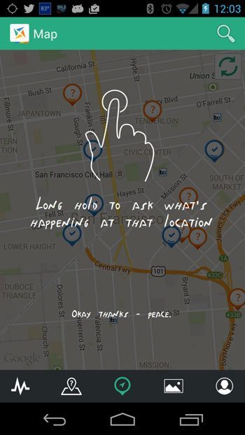
2. Instructional overlays

Often the first time we open a new mobile app a semi-transparent overlay appears over the UI giving us instructions on how it use it. Sometimes this can be necessary but not always if the UI was designed to be intuitive. Before you add something like this ask yourself why this is necessary and if it can be avoided by tweaking the UI to make it more user friendly.
Mandatory fields that don’t need to be
Every now and again I fill out a form that has mandatory fields that I just can’t fill out for various reasons, make sure that any mandatory field you add to a form is both required and applicable to all users. Anyone from Ireland will tell you that we didn’t have postcodes until last year, yet every form online requires a Postcode.
3. Meaningless icons
A picture says a thousand words… icons are great and can be used to create a really intuitive, visual and uncluttered UI but key to this is that users understand the meaning of the icons you use. Users have a limited visual vocabulary when it comes to icons so only use icons that are obvious and everyone understands. Nobody will interact with an icon if thye don’t get it. Stick to the conventions and it should be fine. A fancy navigation may make your site or App stand out, but it may confuse users.
4. Sliders that don’t slide with touch

Sliders are often overused but are a fact of life on websites, especially on mobile where sometimes all the content we want to present to users won’t fit on one page without it looking ridiculous. On desktop we are used to clicking a little arrow to move to the next slide but sometimes on mobile these arrows are too small for our big fat fingers, mobile uses multitouch so I should be able to slide the slider with my finger, there is no excuse for this not being enabled.
5. Asking users for too much information
Users are lazy and impatient when they are online. When asking users to fill out a form only ask them for the information you really need, most of the time its just their name and email. Ask yourself, do you really need their home address and phone number, will you be calling them or posting anything to them? Users are far for likely to fill out a form if its quick and easy.
6. Make the most common action the most obvious
Users often move around a website without reading everything they click, instead, they click what they feel is or should be obvious. See below, this is a payment popup that I interact with regularly for a service we use. Every time I pick Visa and MasterCard from the dropdown and I intuitively click on ‘Close’ because it looks like it should be the ‘Pay now’ button, it’s bigger, darker and stands out. I have literally made the same mistake dozens of times over the last year or two.
A small ‘x’ in the top right would work for close and making the big grey ‘Close’ button a big green ‘Pay Now’ button would make a big difference to the UX, problem solved!
7. Canned email replies
Keep auto responses to a minimum. Sometimes they help but I don’t need you to send me an email everytime I do something online. For example when I unsubscribe from a email list and I get sent an email to say I have unsubscribed from the list, need I say any more?
8. Use video but not exclusively
Online video is very powerful, with broadband and mobile data speeds getting better, video can easily be accessed quickly by more and more people. I see lots of businesses using video exclusively on their websites to explain their product or service and not having much text alternative for those who don’t want to or can’t watch a video.
Your users could be on a bus or in a office without headphones, they might not have the bandwidth or might just want a few lines of text summarising what you do instead of a 3 minute video presentation.
9. For input, show the appropriate keyboard on mobile

This one is easy. You know when you are on a touch devise and you tap a text entry field and your keyboard pops up? If you tap into a field that requires a number but a text keyboard pops up, you have to find the buttons that switches the keyboard to numbers, all a bit painful. A simple line of code on the form field stating the input type <input type=”email”> would make the correct keyboard popup and keep everyone happy.
A well built website with a bit of attention to detail from the developers will make sure the appropriate keyboard pops up to make it faster for inputting text, email addresses or numbers. Developers, all you need to know is here.
10. Links too small for your fingers
Responsive websites have been around for a long time at this point but we still come across websites where the links have tiny tap targets that are just too small for our fingers. Fingers are just not as precise as a mouse pointer is on desktop. The rule of thumb (pardon the pun) is that are area around a tap hotspot should be at least 44 x 44px. Please, don’t make me use my pinky!
Thats it, I could go on, its good to get this stuff out of your system, let us know how UX designers are wasting your time in the comments below.


