UX – 10 things I hate about your website
More than a handsome design or even fulfilling a business objective, a successful website with a great UX must meet the needs of users. It’s simple… the user needs content. And if you can afford your users simple access to this content, you can count on them to return to your site for years to come.
Take a quick scan through the general facts about people in The Psychologist’s View of UX Design and keep these in mind while examining my list of the 10 UX things I hate about your website. Give yourself a website audit. Are you an offender?
1. Your message sucks
You don’t have long to show people what your website is about so a good first impression is essential. When people land on your homepage, they’ll look for something short and bold that can tell them more about you. One strong leading message in which you state what you do, how you do it and what makes you unique is a great key to success. Why we need look no further than our own homepage for a fine example.
2. Can you say that in English?
“The user needs content” but it’s important that when they find it, they understand it. Use plain language as a part of your user-centered design. Talk to people like they are real people. People love this. Check you are using clear and concise language and don’t speak to your audience like they’re a demographic being sold something. If you can, incorporate a story. People love stories. There’s something about stories that engage us like nothing else. Our client Nesta Storage allow their customers to share their personal experiences, offering a fresh insight into how the Nesta process works.
3. Infinite scroll
Ah, the good old infinite scroll where it’s impossible to reach footer. If your website has a footer and an infinite scroll is implemented, then content should never auto-load. Use a ‘Load More’ button instead which gives more control or you can enhance the user experience more by adding some clever filtering as per the DublinTown.ie website.
Some sites move their footer links into a burger style menu, making it accessible from the main navigation. But beware of changing tried n’ tested design functions – you definitely don’t want to confuse your visitors by fiddling with your hierarchical navigation and footer link locations so reinforce common user habits where possible.
4. Popup newsletter subscriptions
Sure, a nicely designed popup window may bag you a few more subscribers for your newsletter database, but I’m not sure it’s worth the traffic you’ll lose when visitors abandon your site in exasperation.
A better alternative is a mini or modal popup that appears off-centre/on leaving the page, so that valuable content is not blocked while the user is viewing it (see a live example of this on the Invision blog here). Receive extra brownie points if you employ a special cookie to stop this modal popup from appearing if the user has closed it on a previous page!
5. Crap imagery
There is no excuse for using images such as the ones below. These guys don’t actually work for your company now do they?
 Scattered-round-the-place generic stock photography for the sake of it helps no one, so by extension, it won’t help you. If you can, show pictures of your customers, your people, your products, your location. Or have a professional create visuals that directly relate to what you do. Do your website a favour and give it a fresh face.
6. Above the fold…
We’re all sick of the phrase so let’s go ahead and bin the myth of ‘above the fold’ right now and forever more. However, let’s agree that the fold continues to exist as a concept. Users scroll when there is reason to; if what we see at the top is promising; if we deem it worth the hassle.
This is no excuse to cram all your essential content into a browser size area. Be clever and fill this space with interesting info and compelling content which will draw the user in.
7. …And cramped page layout
Why do people love to read stuff on Medium? Well apart from their choice selection of informative/compelling thoughts and stories, they have a deep understanding of how people consume blog posts. Hence, their template is perfectly crafted to attract the human eye & can turn a lengthy 20-minute article into a blissful reading experience.
It’s never too late to improve the design of your pages. Present your content in the best possible way so readers take pleasure in reading it. Clean lines and spacing between text and in and around elements will make them want to stay longer and more inclined to interact with your website.
Use a clean light background colour to avoid overloading visual nerves. Create space to let your content breathe and shine. Crank up the margins and paddings around everything. Increase font size (and line height): 16px is the minimum size Smashing Magazine recommends for body copy. The font you use also influences how legible your content is: think simple, not fancy.
8. Links opening in the same window
Are you looking to direct users away from your website? Interested in higher bounce rates in your monthly site stats? If so, just open links to other websites in the same window.
Don’t send away your hard-earned traffic. You’re raising the chance that people will get distracted and forget to come back to you.
So check your website’s hyperlinks now, making sure that:
→ internal links open in the same window
→ external links open in a new one.
9. Sluggish load times
Speed is more important than ever. Sitting around waiting for pages to load builds frustration, and if it takes too long your guests won’t hang around. Obviously this is influenced by the connection speed of the user, so some of it is out of your control. So get onto Google Analytics to find out what percentage of your users have different types of internet connections and in turn a better idea of how fast your pages need to load. If it takes more than 4 or 5 seconds you’re in trouble as most will give up after the 4th second. Take measures to ensure your website loads in no more than 2.
10. What does that say?
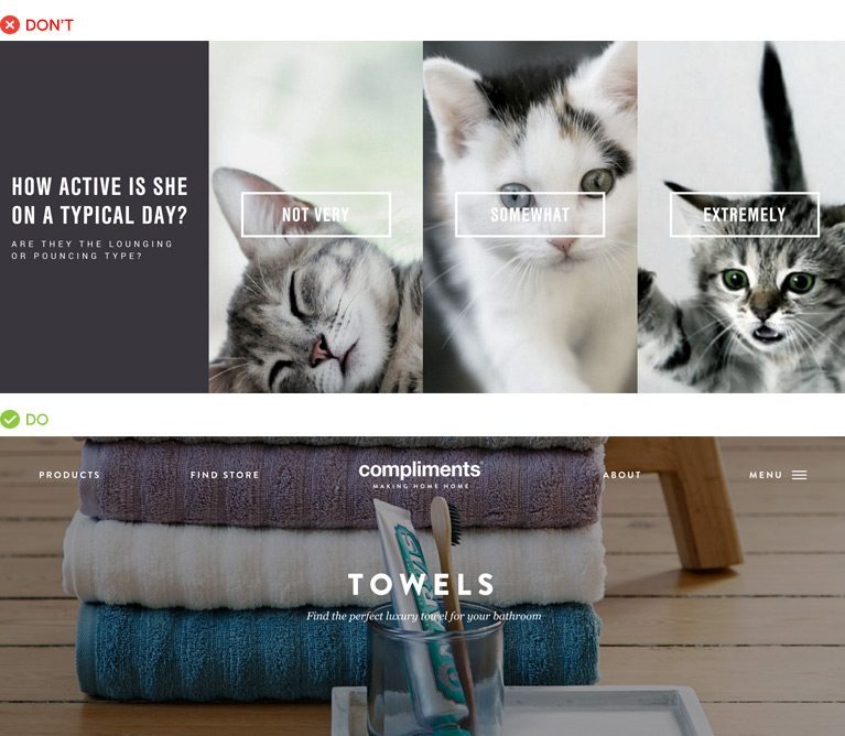
Images play an important role, so it can be a clever move to place text on top to leverage the attention-grabbing aspect of the photo. But this endeavour commonly backfires, when the contrast between the text and the background is too low.

Some measures you can take: overlay the entire photograph with a translucent black (or colour can work too) so the white text on top pops out; add an opaque box behind the text, which will still be legible while showing the image behind; and blurring the image removes the detail so your text is crisp and clear, an effect widely used across Apple iOS devices.

If you’ve got any ‘faux-pas’ that wreck your user experience when browsing the web, we’d love you to add to the list. And as always, if you need any advice or assistance with your website, we are here to help 🙂


