10 Things We’ve Learned From Over 500 Hours of User Testing
From a quick back of a napkin calculation over lunch, the UX team at Friday discovered that we have collectively sat through over 500 hours of user testing (that’s 20 days without sleep!). Our team has conducted user testing on many, many apps and websites, either during the redesign process or as part of UX audits.
It’s fascinating looking at the patterns of human behaviour that emerge by observing people using apps and websites.
We figured it would be fun to compile some of the most common issues that regularly pop up across user testing. There are many myths about what end users want or expect from an app or website – most of these are based on pure assumptions and personal bias. We hope to dispel some of these myths.
1. Where’s the Home button?
Everyone knows that when visiting a website, if you click the logo it will bring you back to the homepage, right?
Wrong. This is something we always observe in user testing when we prompt participants to go back to the home screen. You’d be surprised how many people use the back button in the absence of a home button. The tech-savvy will use the logo but we would hazard a guess that somewhere in the region of 50-60% of people will not know this. Implicit as well as explicit links are needed until everyone is categorised as ‘tech savvy’!
2. What does this company actually do?
The opening title on your website holds immense significance as a communication tool. It serves as the stage-setter, introducing users to your identity, purpose, and approach. Ambiguity often leads to users navigating away. While I won’t delve into perfecting the art of writing titles for the hero area of a website, I will say that a few minutes into testing, it’s not uncommon for a user to ask “What does this company actually do?”.
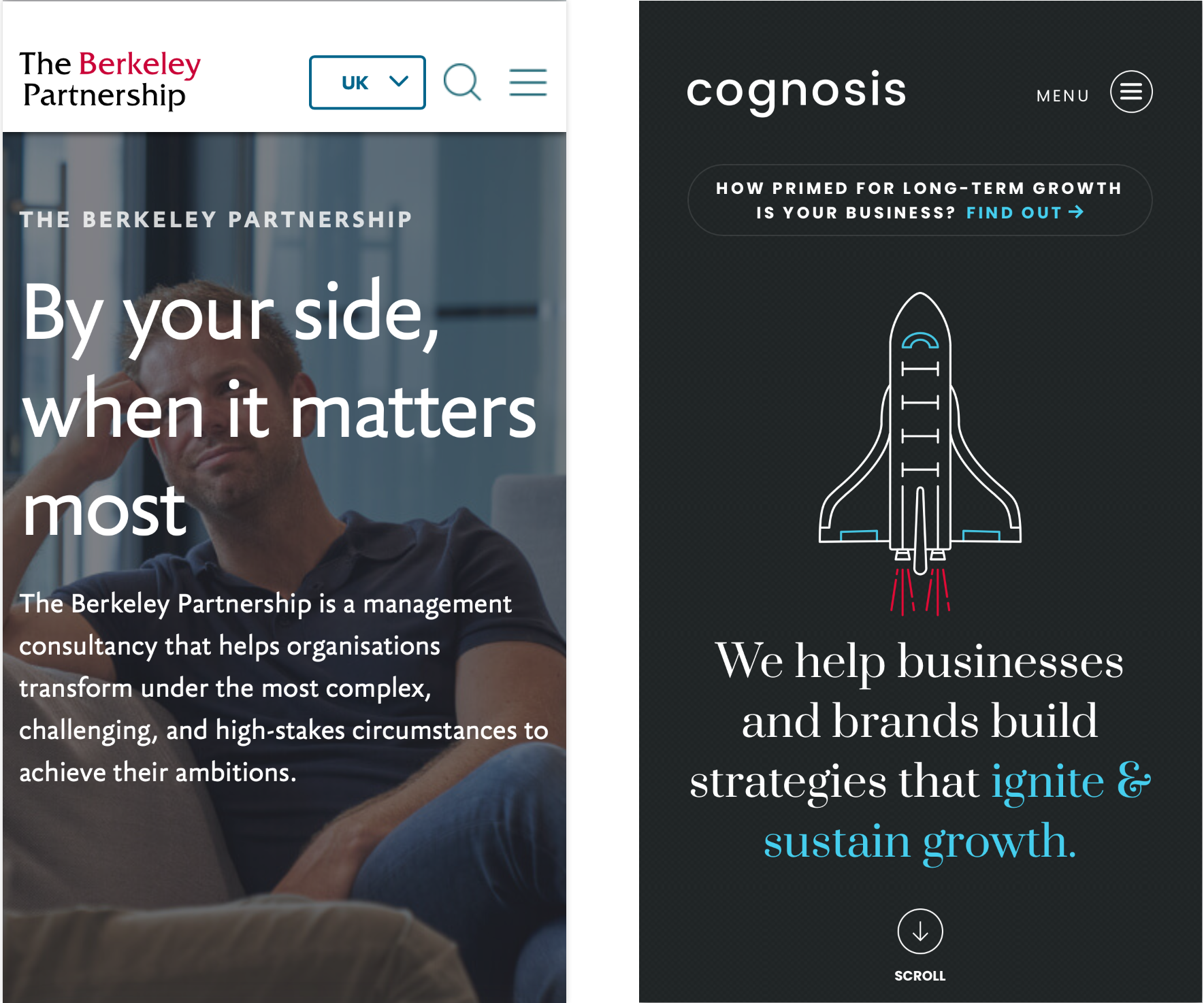
Consider these two homepage examples from within the same industry, providing a similar service. Examining the first one on the left, does its title readily reveal its product/service or even industry? On the other hand, Cognosis (right) takes a more explicit approach. Their message conveys a simple mission of aiding business growth. In a single line, users discern if they’re in the right place and can proceed accordingly. If your brand is not a household name, be clear and direct about who you are and what you do.

3. Don’t make me read!
Another observation we often note is how much people don’t like to read, users will scroll and scan the page looking for something that is a visual match with the expectation they have in their head. In most cases, users might read buttons, calls to action or titles (if they are short) but they will not read any more than a couple of lines of text unless there is a clear task and they have motivation to do so.
In our experience, the younger the audience the less patient they are when it comes to reading. Sorry, but unfortunately nobody wants to read your 15,000-word mission statement! Designing for scan reading is key to conversion.
4. Icons (for everything)
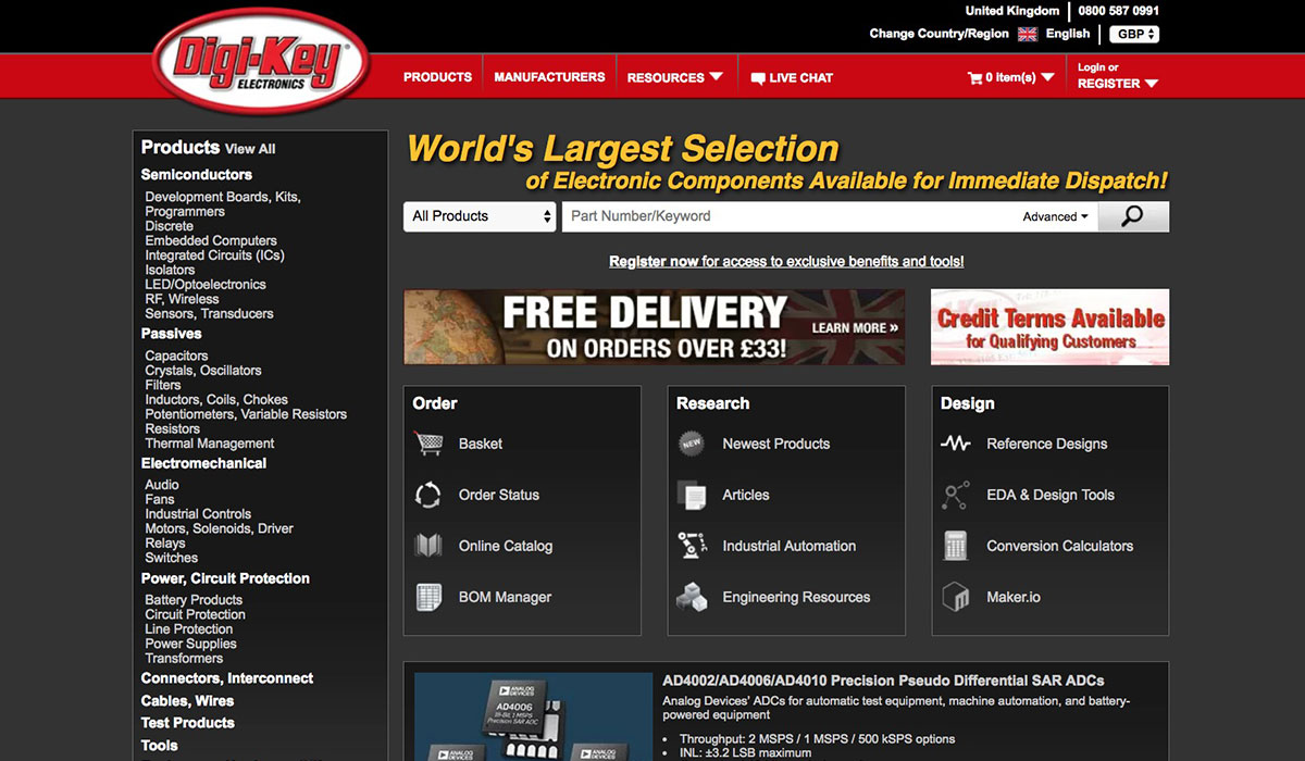
While icons can enhance usability, communication, and aesthetics, overusing icons can lead to various issues and challenges. An assumption might be made that everyone knows what a square with a dot in the middle of it is! The reality is that there is a very small set of truly universally recognisable icons. Sometimes you’ll need to add some text beside an icon to help communicate it better but is this the right solution? We see it all the time, incomprehensible icons simply get ignored, so it’s worth making sure your icons make sense and that means testing.
5. Burger menus
Mary discussed burger menus a few years ago; how they can be a bit of a blind spot for users and raise issues with content discoverability. Burger menus are often a necessary evil on mobile apps and websites. They have a clear function of housing navigation that simply cannot be presented out front because of space constraints. It is amazing how little people actually use them, at least in our user testing, people are much quicker to scroll to find what they are looking for (see my next point). It’s like users see them as a last resort for navigation when all else fails.
Take note: Never, ever use a burger menu on a desktop website, you have the space for navigation, use it!
6. Everybody Scrolls
When it comes to mobile website design, navigation can be tricky. We have looked at the dreaded burger menu and there still seems to be a high level of anxiety about what is ‘above the fold’ coming from website owners, a concept that goes back to the beginning of the printing press.
When it comes to above the fold, sure, we need to ensure the most engaging content is visible, but users will and do scroll. Scrolling is the most common navigation action a user will take, people are much more inclined to scroll in order to find what they are looking for over going into a menu.
When it comes to above ‘the fold’, use discipline. Cramming as much as possible above the fold will result in poor engagement, users won’t know where to look, which leads me beautifully on to my next point…
7. Options: Don’t make me think!
You know when you go to a restaurant and they hand you a multi-page menu that is like a short novel, you can’t make a decision and end up panic ordering the cauliflower and squid risotto (and later regretting it).
Too many options cause what we call increased cognitive load and this usually ends in user frustration. We’ve always noticed when a user is presented with more than 3 or 4 options at any one time, they get flustered. A flustered user often walks away. Keep it simple.

8. Put it in a Carousel
While carousels can seem like a good way to display a variety of content in a limited space, they come with several pitfalls that can negatively impact user experience. Contrary to belief, just because you have a carousel doesn’t mean users will engage with it, in fact, they have low engagement and interaction rates.
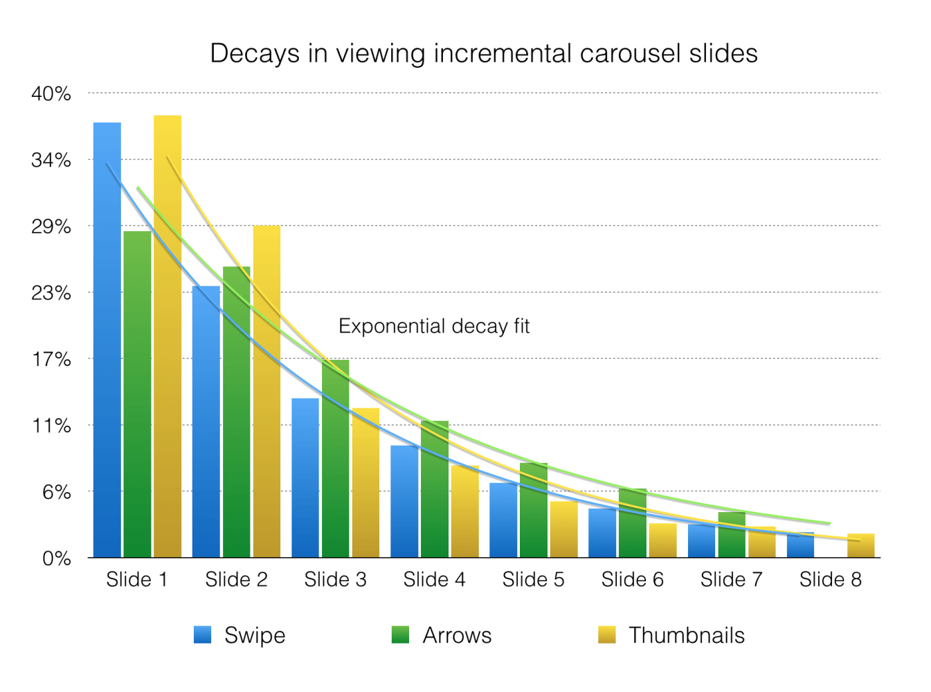
Unfortunately, very few users will get to see the 23rd frame of your carousel but they will notice how long the screen takes to load. In our experience, most users just scroll past them unless something really catches their eye. Vitaly Friedman from Smashing Magazine created this nice little chart showing how fast engagement rates fall on the second and third slides in a carousel.

Credit: Vitaly Friedman, Smashing Magazine
9. Meeting Expectations
Every user testing session and task begins with asking the participant what they expect before they start. Based on this input, we’ll have a good idea if we’re going to get positive feedback or not. If we can meet the users expectations through intuitive interactions, trust-building, and ultimately a positive user experience, thats a win, it’s as simple as that.
The only way to establish user expectations is research.
10. Positive Moments
Sometimes life can be mundane, especially when you have your head stuck in a screen. We talk about how good UX can be achieved by meeting users’ expectations, great UX is about exceeding them. A simple way to do this is to consider designing for emotional delight. Sounds a bit fluffy? Just bear with me!
A simple, maybe subtle and unexpected animation, message or sound that makes the user smile. Humour goes a long way and helps lift your brand’s personality. We’ve seen faces light up with well-thought-out micro-interactions or interface feedback that leaves the user with a positive impression, this reflects on the brand.


Hopefully, these points will help you avoid some of the most common pitfalls in UX design. Do get in touch if you need help with user testing or any area of UX research and UX/UI design.


